With over 5 million apps competing for attention across the App Store and Google Play, launching an app is only the beginning. The real challenge is growing, retaining, and monetizing your user base — and that starts with tracking the right mobile app metrics.
This guide breaks down the key app metrics every app developer, product manager, and marketer should track — from engagement and retention to conversion and revenue.
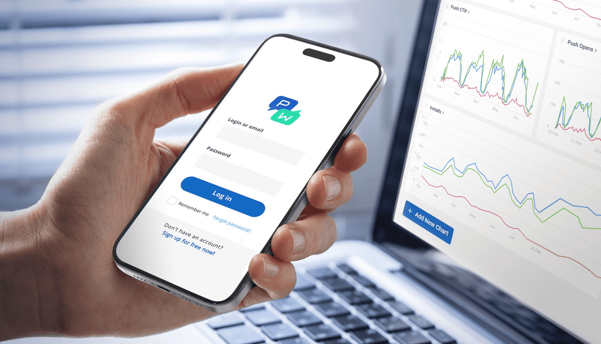
And along the way, you will see how Pushwoosh — a customer engagement platform purpose-built for mobile — helps you not only track app performance but act on the data.
What are mobile app metrics and why do they matter?
Mobile app metrics (also called mobile app KPIs) are measurable data points that indicate how well your app is performing across acquisition, engagement, retention, and monetization.
For app developers, these metrics reveal stability and usability issues. For product managers, they validate feature decisions. For marketers, they prove campaign ROI and guide budget allocation.
Here is why tracking mobile app metrics is non-negotiable:
- The app market is massive and growing. Global consumer spending on mobile apps surpassed $171 billion in 2023, yet the average app loses 77% of its daily active users within the first three days after install.
- Retention is cheaper than acquisition. Acquiring a new user costs 5–25x more than retaining an existing one. Metrics like retention rate, churn rate, and session interval tell you whether your app is sticky enough to justify acquisition spend.
- Revenue depends on engagement. Users who engage deeply — measured by session length, feature adoption rate, and DAU/MAU ratio — are far more likely to convert, subscribe, and generate long-term revenue.
Audience & acquisition metrics
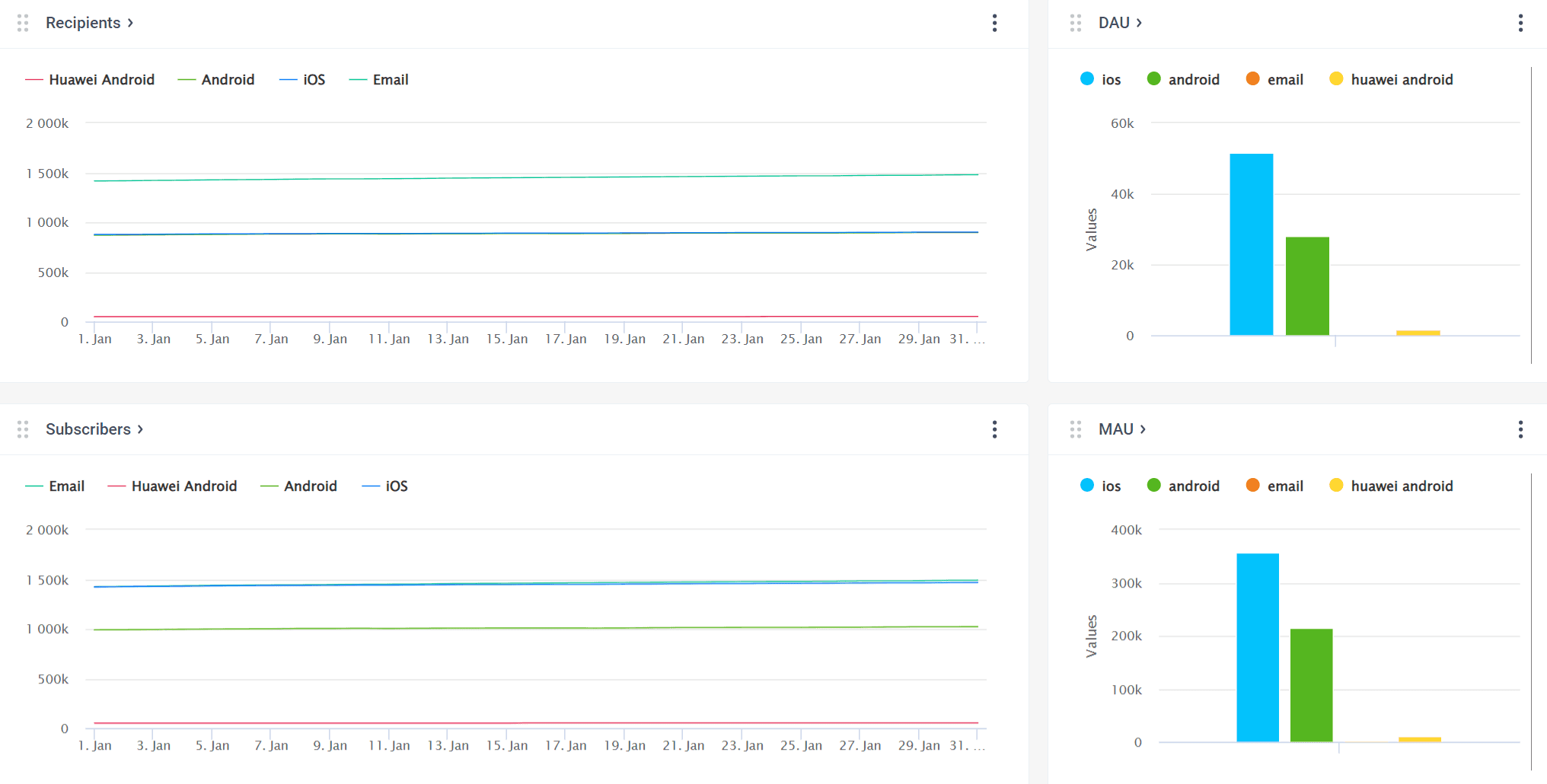
Recipients
Devices that enabled push notifications or emails from your particular app or website. This is the audience that actually receives your communications, since they expressed their consent in the form of a push notification opt-in or an email subscription.
To boost the number of recipients, you can encourage opt-ins and subscriptions via in-app messages explaining the core values and benefits that your communications can deliver.
Subscribers
This metric shows devices with push tokens or emails provided, reflecting the audience that is technically reachable via push notifications, emails, or in-app messages.
DAU (daily active users)
Daily Active Users — the number of devices on which the app is launched per day (total for all platforms).
You know how many app downloads you’ve had, but how many of those who’ve installed it, actually use it? The Daily Active Users will give you the answer. Because it refers to the number of devices, not to the number of sessions, each person is counted just one time, and it doesn’t matter if they launch your app once a day or ten times a day.
📖 Learn how to increase your number of DAU with relevant communications. The post features benchmarks.
MAU (monthly active users)
Monthly Active Users — the number of devices on which the app is launched per month (total for all platforms).
Just like DAU, monthly active users tells you the unique number of people who used your app. However, it tells you about those who launched your app in the last 30 days.
📖 To increase MAU, start with benchmarking and then try out a few proven techniques we’re sharing in this blog post.
App installs
The number of new Total Devices, i.e., the number of devices registered for the app with a HWID (whether they have push tokens or not).
This mobile app user acquisition metric shows you how effective your user acquisition efforts were in a specific period.
Engagement metrics
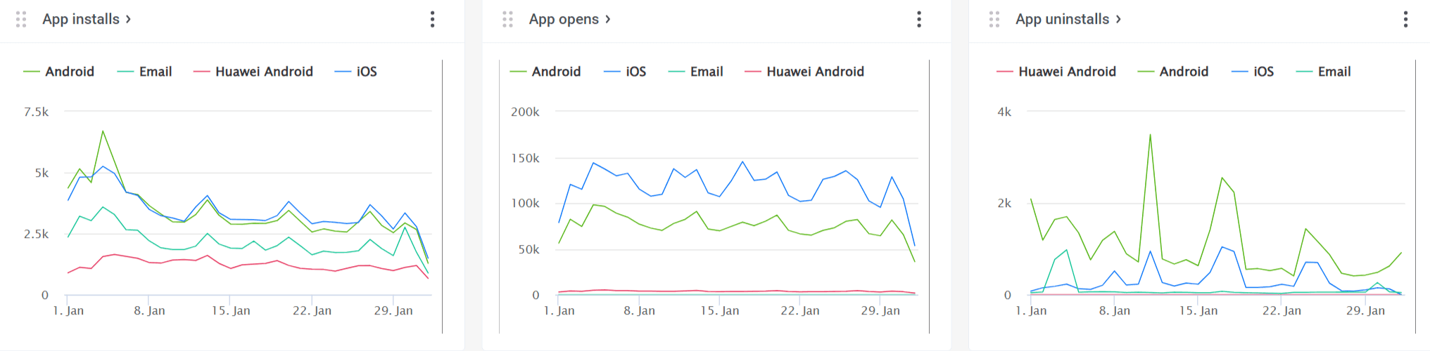
App opens
The number of times the app has been launched on users’ devices as of the date and time specified.
Similar to DAU, but refers to the number of sessions, so each person is counted as many times as they launch your app. A high number of app opens means users enjoy your app!
DAU/MAU ratio (app stickiness)
The DAU/MAU ratio measures app stickiness — how frequently your monthly active users return on a daily basis. Calculate it as (DAU / MAU) × 100%.
A high ratio means your app has become part of users’ daily routines — one of the most reliable indicators of product-market fit. Here is how to interpret it:
- Below 10% → low stickiness; users install but rarely return
- 10–20% → average for most app categories
- 20–50% → strong engagement; users form a daily habit
- 50%+ → exceptional; typical of social media and messaging apps
Average session length
The average time a user spends in the app per session, calculated as the time between app open and app close (or backgrounding) events.
Longer sessions generally indicate deeper engagement and higher satisfaction. However, context matters: a banking app with short, efficient sessions may be performing well, while a gaming app with short sessions may signal a problem.
Track session length alongside conversion events. If sessions are long but conversions are low, users may be struggling with your UX. Pushwoosh’s Events Dashboard helps you correlate session behavior with specific in-app actions.
Session interval
The average time between a user’s consecutive app sessions — calculated as the average gap between sequential app open events for each user.
A short session interval indicates strong habit formation: users return frequently without being prompted. A growing session interval is an early warning sign of disengagement, even before DAU starts to decline.
Feature adoption rate
The percentage of active users who use a specific feature within a given period. Calculate it as (Unique users who used the feature / Total active users) × 100%.
This metric is critical for product managers and UX designers. It validates whether new features deliver value, reveals which parts of your app drive engagement, and highlights features that may need better discoverability or onboarding.
Retention metrics
Acquiring users is expensive. Retaining them is where the real value lies. Retention metrics tell you whether your app delivers enough ongoing value to keep users coming back — and where you are losing them.
Retention rate
The percentage of users who return to your app after their first visit, measured at specific intervals — commonly Day 1 (D1), Day 7 (D7), and Day 30 (D30). Calculate it as (Users at end of period − New users acquired during period) / Users at start of period × 100%.
Retention rate is arguably the most important metric for long-term app success. A high retention rate reduces your dependency on constant (and costly) user acquisition and signals genuine product-market fit.
- D1: 25–30% → average across categories
- D7: 10–15% → solid
- D30: 5–8% → healthy for most apps
To boost D1 and D7 retention, set up automated onboarding sequences in Pushwoosh’s Customer Journey Builder — welcome pushes, in-app feature walkthroughs, and follow-up emails that guide new users to their “aha moment.”
Churn rate
The percentage of users who stop using your app within a given period — the inverse of retention rate. Calculate it as (Users lost during period / Users at start of period) × 100%.
High churn is a direct threat to growth: if you are losing users faster than you acquire them, no amount of marketing spend will save your app. Churn rate ties directly to app uninstall tracking and signals where in the user lifecycle you are failing.
Pushwoosh’s behavioral segmentation identifies at-risk users — those with increasing session intervals, declining app opens, or inactivity for a defined period. Use the Customer Journey Builder to trigger automated re-engagement campaigns (push notifications, emails, in-app messages) before these users churn entirely.
📖 Learn strategies for reducing churn with triggered messaging.
App uninstalls
The number of devices for which push tokens were removed from the database because they were invalid or non-existent. A rising uninstall rate is a key churn rate signal that demands investigation.
Conversion & revenue metrics
Engagement and retention set the stage, but ultimately your app needs to drive measurable business outcomes. These mobile app monetization metrics tell you how effectively you convert user activity into revenue.
Conversion rate
The percentage of users who complete a specific desired action within your app — whether that’s account registration, first purchase, subscription activation, or completing a tutorial. Calculate it as (Users who completed the action / Total users exposed to the opportunity) × 100%.
Conversion rate directly measures the effectiveness of your app design, UX, and marketing efforts in driving business value. Small improvements in conversion rate can have outsized revenue impact.
User lifetime value (LTV)
User lifetime value (also called LTV, CLTV, or customer lifetime value) — the total revenue a single user is expected to generate throughout their entire relationship with your app. A simplified formula: LTV = ARPU × Average customer lifespan. For more precision: LTV = Average purchase value × Purchase frequency × Customer lifespan.
LTV is the north-star metric for sustainable growth. It tells you how much you can afford to spend on user acquisition (your LTV must exceed your Customer Acquisition Cost), helps you identify your most valuable user segments, and guides long-term product and marketing strategy.
Pushwoosh’s RFM segmentation (Recency, Frequency, Monetary) automatically categorizes users by their engagement and spending behavior. Use this to create targeted campaigns that nurture potential high-LTV users (e.g., personalized upgrade offers for frequent users who have not yet subscribed) and retain your existing high-value segments with exclusive content and loyalty messaging.
Average revenue per user (ARPU)
The average amount of revenue generated per active user within a given period. Calculate it as ARPU = Total revenue / Total active users (for the same period).
ARPU measures your app’s overall monetization efficiency. It helps you benchmark against competitors, evaluate the impact of pricing changes or new revenue streams, and track whether your monetization strategies are improving over time.
How to effectively monitor and improve your mobile app metrics with Pushwoosh
Knowing what to track is step one. The real question is: how to track app performance effectively and turn data into action? This is where Pushwoosh goes beyond a mobile analytics tool — it is a full customer engagement platform that connects insights to execution.
Pushwoosh Statistics provides a comprehensive mobile app analytics dashboard with several ready-to-use reports. Project Overview provides a visual summary of your app growth and messaging performance.
Dashboards display the key metrics in dynamics and allow you to gain deeper insights into:
- 🔊 Specific channel performance (Push notifications, Emails, and In-apps Dashboards)
- 🎯 Conversions into target actions (the Events Dashboard)
- 🚀 Overall app success (the Application Dashboard)
In addition, you can create custom Dashboards to serve your analytics needs.
The result: all your mobile app metrics in one place, updated in real time, with no need to switch between multiple tools.