You launched a customer journey. Users are coming in, messages are being sent, and the journey looks alive. But the conversion rate is below expectations. And you have no idea which step is the problem.
Is it the timing? The channel? The copy? A deliverability issue you can’t even see?
Use this guide as a step-by-step diagnostic checklist — within 15 minutes, you’ll know exactly where your journey breaks and what to fix first.
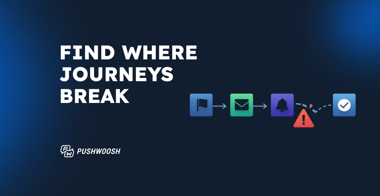
Pushwoosh Journey Statistics gives you a step-level diagnosis directly on the canvas.
Read your journey as a funnel
Every journey is a funnel — you just need to make the numbers visible.
The numbers on each arrow between elements represent your audience progressing through each step. Read them top to bottom:
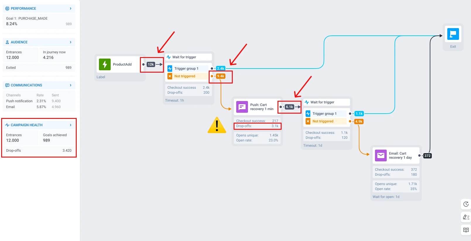
Let’s interpret the statistics. Here we have a cart recovery journey as an example. 12,000 users add a product to cart and enter the journey. After a 1-hour wait, 2,400 purchase on their own — great, they exit with a goal. The remaining 9,400 move on to a push notification. But look at the next arrow: only 6,100 continue to the second step. That means 3,100 users dropped off at the push — not because they ignored it, but because it was never delivered.
That’s your bottleneck. Not the entry. Not the email at the end. The push notification step.
Campaign health in the left panel gives you the high-level picture: total entrances, messages sent, messages opened, and drop-offs over time. Use it to spot trends across days and weeks. But the canvas is where you pinpoint the exact element that’s leaking users.
Once you’ve found the step with the steepest drop, double-click on it. This opens element-level statistics — and that’s where diagnosis begins.
Is it a delivery problem or an engagement problem?
This is the question most marketers skip, and it costs them iterations.
Let’s zoom in. If you take a closer look at the messaging element statistics, you can see goals reached, opened, CTR, and drop-offs.
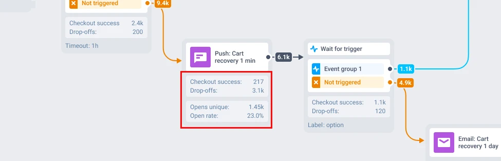
Need to go deeper? Click Full statistics on any message element.
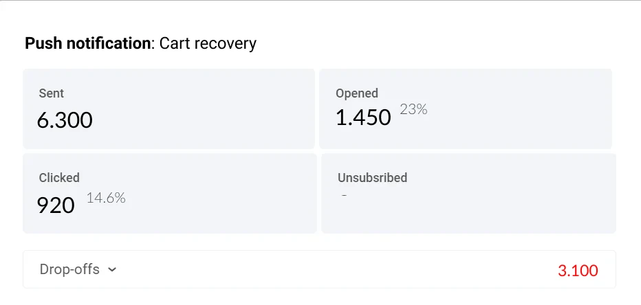
Expand the Drop-off block to see why users were lost.
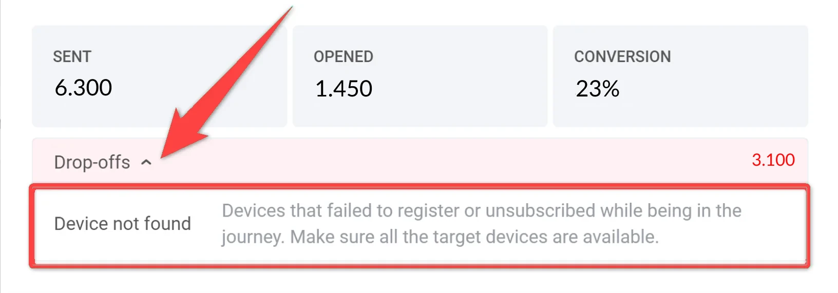
This is where Pushwoosh separates two fundamentally different problems:
Delivery problem: messages never reached users. Drop-off reasons like “Device not found,” “Token expired,” or “Emails reached limits” mean your content was fine, but the infrastructure failed. No amount of copy editing will fix an expired push token.
Engagement problem: messages were delivered but ignored. High sent count, low opened/clicked — that’s a signal to revisit your content, timing, or channel choice.
The fix depends entirely on which category you’re in:
| What you see | Likely cause | What to fix first |
|---|---|---|
| High drop-offs with "Device not found" or "User not found" | Users entered the journey before registering a device or User ID | Review your entry trigger — make sure registration completes before journey entry fires |
| High drop-offs with "Token expired" | Push tokens expired between entry and message send | Shorten the delay before push steps, or add a reachability check element |
| High sent, low opened | Wrong timing, or the message isn't relevant enough | Test send time (morning vs. evening) and revisit subject lines or message copy |
| High opened, low clicked | Content engages, but CTA is weak or unclear | Rework the call-to-action — make the next step obvious and frictionless |
| High clicked, low goal conversion | Users engage but don't complete the target action | Check if the deep link lands on the right screen, and whether the goal event fires correctly |
Confirm with a real user path
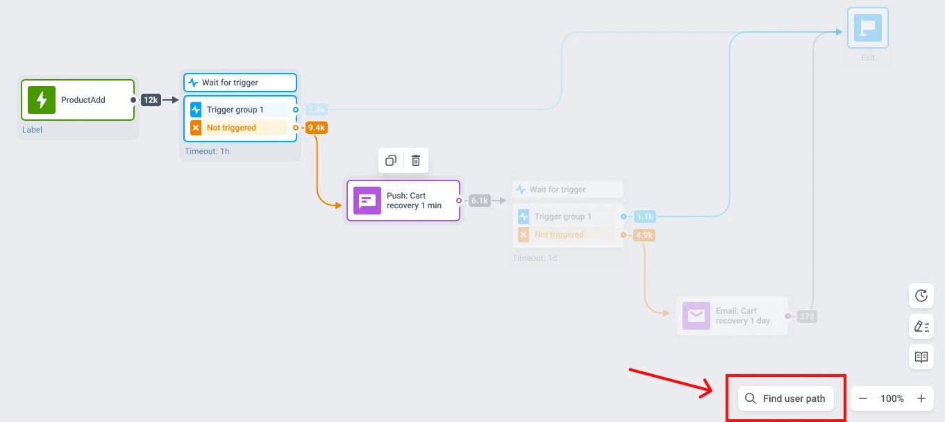
Numbers tell you where users drop. User path tracking shows you how.
Click Find user path at the bottom of the canvas, enter a User ID, and Pushwoosh highlights the exact route that person took — every step completed, every branch followed, every point where they exited.
If you suspect the push notification step is the bottleneck, check 3–5 real user paths. Do they all stall at the same element? That’s a pattern — your diagnosis is confirmed. Do they diverge at the Wait for trigger element before it? Then the bottleneck might be upstream: a wrong segment, not a wrong message, or a delivery problem.
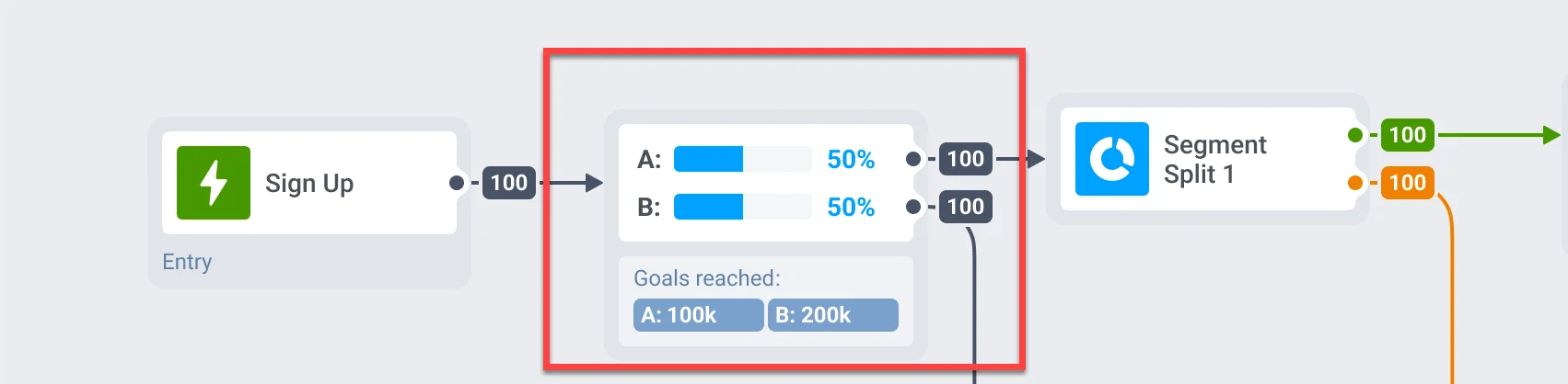
Compare A/B/n branches: real wins vs. noise
If you’re running A/B/n splits inside your journey, stats appear directly on the canvas for each branch. You see opens, clicks, and goal conversions side by side.
But not every difference is a real win. Before you crown a winner, check three things:
1. Look at goal conversion, not opens. Branch A might have a higher open rate, but Branch B drives more purchases. Opens are vanity; goal completion is the metric that matters.
2. Check the sample size. If Branch A has 50 users and Branch B has 5,000, the comparison is meaningless. Wait until both branches have enough volume for the numbers to stabilize. A general rule: at least 1,000 users per branch for push, more for lower-frequency channels like email.
3. Give it time. Don’t call a winner after 24 hours if your journey includes a 48-hour time delay. Let users complete the full flow before comparing outcomes.
When a branch consistently outperforms on goal conversion with sufficient volume over a meaningful time period — that’s your signal to scale it. Pause the underperformer, shift traffic, or rebuild the losing branch with a new hypothesis.
Optimize your journeys with Pushwoosh
Journey analytics isn’t a one-time check. It’s a loop: read the funnel → find the drop-off → diagnose the cause → fix → measure again.
The teams that improve fastest aren’t the ones with the best first journey — they’re the ones who diagnose and iterate the quickest. Pushwoosh Journey Statistics keeps that loop inside one interface: no switching to a separate analytics tool, no exporting data to make sense of it, no waiting for an analytics team to pull a report.
Build → launch → diagnose → fix → repeat. All on the same canvas.