The struggle is real: you’ve poured countless hours into building an amazing app, but getting users to stick around feels like an uphill battle. With millions of apps vying for attention, nearly one in two are uninstalled within the first month after download. More than just acquisition, mastering user engagement is crucial to driving real growth.
In this article, we’ll not only define essential user engagement metrics to track but also show you how to measure and improve them. This practical guide leverages real-world strategies to turn insights into action, transforming casual users into loyal ones.
What are the key user engagement metrics to measure?
User engagement metrics tell you how people interact with your app — how often they return, how long they stay, what actions they take, and whether they find value in the experience. These metrics go beyond downloads or installs — they reflect actual usage and interest.
Think of them as your app’s vital signs: they show whether you’re building habit, trust, and loyalty, or losing active users before they even get to see the value. These metrics aren’t just vanity numbers; they’re signals of product health and user satisfaction.
Here are the most important user engagement metrics for any app:
In the following sections, we will delve deeper into each of these metrics, explaining exactly how to measure and track user engagement metrics.
More importantly, we’ll show you how to boost these numbers using proven strategies and real examples from Pushwoosh clients across industries.
User activity metrics → make users come back daily
User activity metrics — DAU, MAU, and stickiness — are the pulse of your app’s engagement. They tell you how many people are using your app and how often.
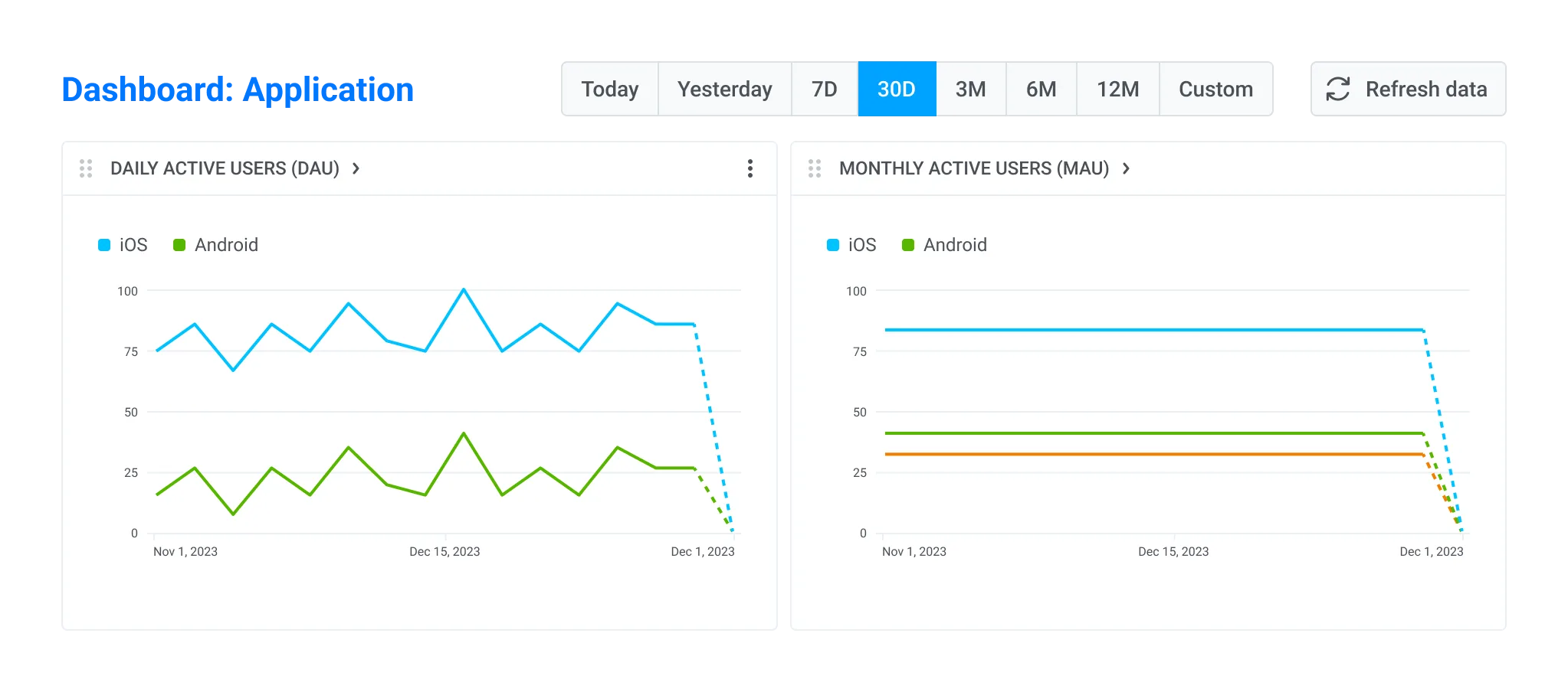
DAU & MAU
DAU (daily active users) and MAU (monthly active users) refer to the number of users who open your app each day and month, respectively. High numbers here mean your app succeeds in engaging and delivering value to a significant audience.
DAU is a crucial success metric for apps making part of users’ daily routines (e.g., news, fitness, finance), while MAU matters to almost every app as it gives a broader view of the user base without overemphasizing daily behavior.
How to measure DAU & MAU
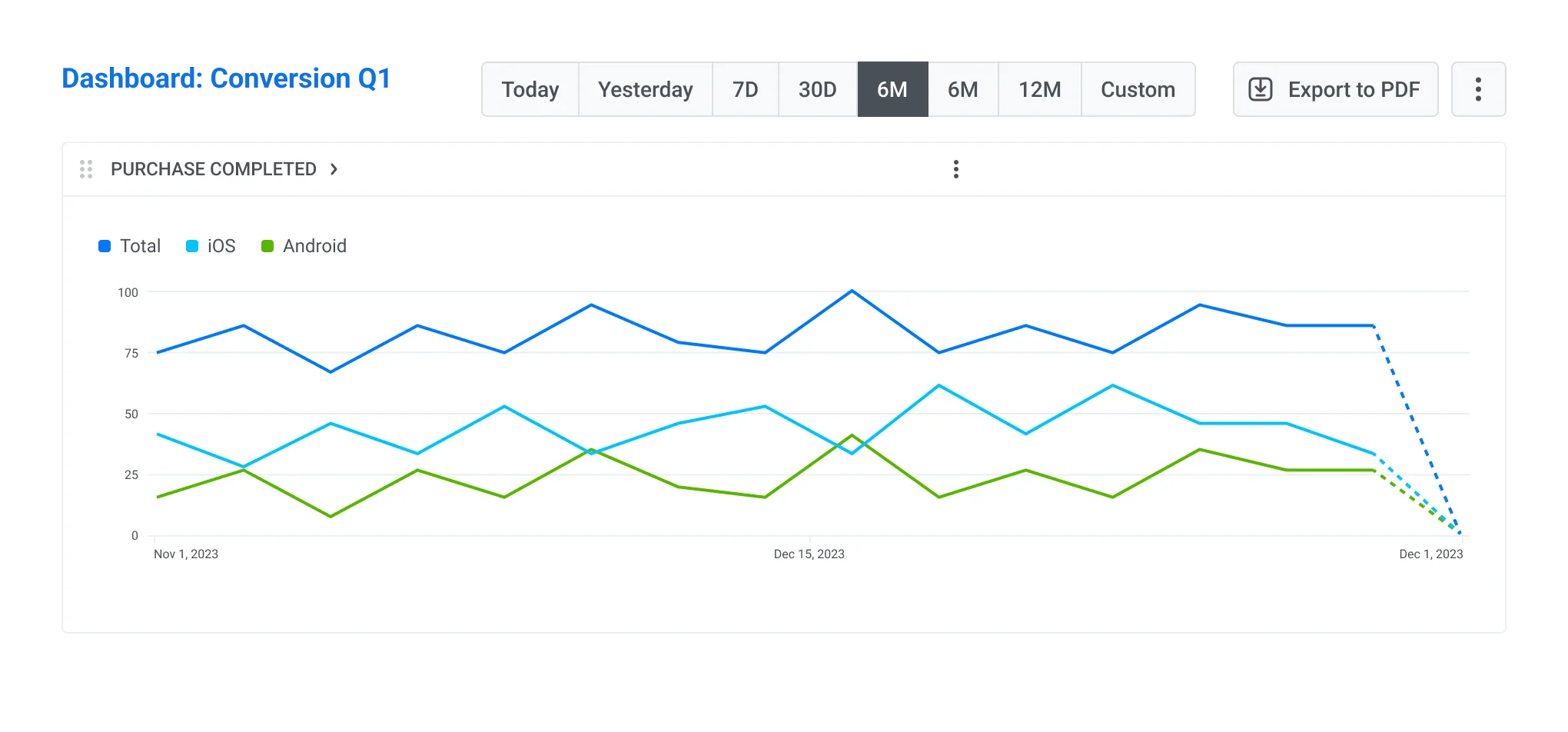
📊To track: In Pushwoosh, go to Statistics > Dashboards > Application and monitor your DAU and MAU in real time
Another option is to track DAU and MAU using your preferred mobile analytics tools, such as Google Analytics, Amplitude, Mixpanel, Piano, or UXCam.
Stickiness rate
While DAU and MAU help you gauge regular user activity, stickiness measures depth of user engagement — how many of your monthly users engage with your app daily. That’s a strong predictor of retention and long-term value.
How to measure stickiness
Stickiness is often visualized as a percentage:

How to improve DAU, MAU & stickiness rate
Best practice: Event-triggered messaging based on user behavior
Responding to specific user actions (or inaction) in real time is incredibly powerful when you aim to increase user engagement. You can send contextual messages that feel timely and helpful and naturally encourage users to return to your app.
To easily automate your behavior-triggered communications, use Pushwoosh Customer Journey Builder. Let’s see how it works in practice.
Real example: +16.62% MAU & +4.58% revenue with event-triggered messages
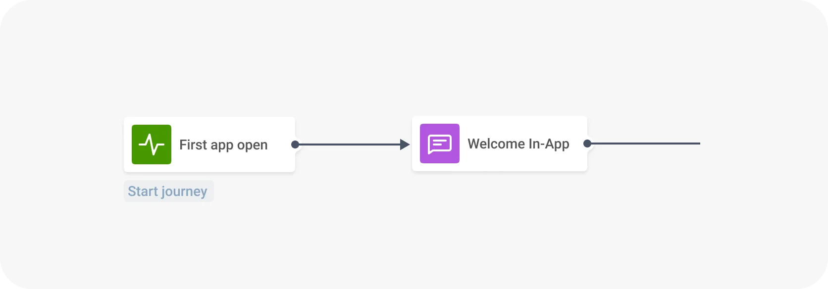
Bladestorm significantly boosted user activity with automated, personalized messages sent in response to specific in-app events in real time.
For example, one journey triggered welcome messages at the user’s first app open:
Another journey reactivated users who had been inactive for three days, sending them contextual push notifications with promo codes.
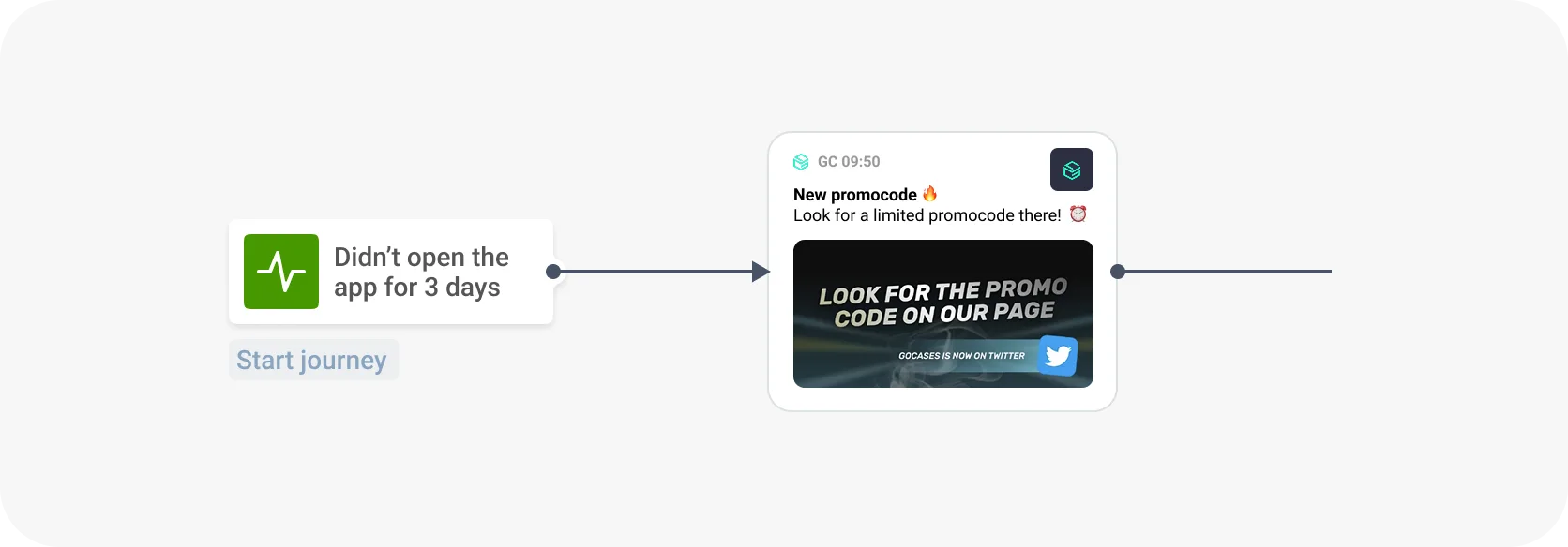
The result: The strategy led to a 16.62% increase in MAU and directly contributed to a 4.58% boost in ARPU, proving that automated, relevant messaging drives real business outcomes.
App usage metrics → encourage deeper engagement
These metrics reveal what happens after a user opens your app: how often they return, how long they stay, and how actively they explore. It’s your window into the depth of engagement, not just surface-level activity.
📊 To track: Most analytics tools — including Google Analytics, Amplitude, Mixpanel, Piano, and UXCam — track session_start, session_end, screen_view events automatically and provide insights into the key session metrics covered below.
Session frequency (or app usage frequency)
Tracks how often a user opens your app within a defined timeframe — for example, three sessions per week. It indicates how well your app is integrated into a user’s routine.
More frequent sessions reflect a stronger product habit, which can boost retention and monetization. This is especially valuable for apps where repeated interactions matter (fitness trackers, news, education tools, and mobile games).
How to measure session frequency:
Session frequency = number of sessions per user over a given timeframe.
Average session duration (aka average visit time or session length)
Shows the average time a user spends in your app per session — a strong signal of engagement depth.
Longer sessions can indicate that users are reading content, browsing products, or completing key tasks. It’s a key monetization lever in content and gaming apps where time spent = value created.
How to measure average session duration:
Session duration = time between session_start and session_end.
Screen views per visit
Counts how many different screens users interact with in a single session.
This metric helps you understand how actively users explore your app. It can also reveal how engaging your navigation is — or where drop-offs happen.
How to measure screen views per visit:
Screen views per visit = number of screen_view events ÷ total sessions.
App session intervals
Measures the time between two sessions from the same user — essentially, how long it takes a user to return after their last visit.
Shorter intervals = stronger habit formation. It’s an early sign of app stickiness and potential retention.
How to measure app session intervals
Session interval = time difference between two session_end and session_start events from the same user.
How to improve session metrics
Best practice: Create personalized experiences in and out of the app.
This strategy leverages targeted messages to guide users, highlight valuable content, or introduce new features exactly when they are most receptive. By making the user journey more intuitive, rewarding, and relevant, you naturally encourage deeper exploration and longer, more frequent sessions.
Improving session frequency and session length are often treated as one, but they require different levers.
To boost session frequency, you need external triggers: push notifications, emails, reminders, or widgets. But blasting discounts isn’t enough. One of our clients in the delivery space relied heavily on discount-based messages. Conversion rates were high, but only when users were already in the mood to order. If not, the message was ignored.
So, we shifted strategy. We built a content-driven approach that surfaced relevant insights based on user behavior and location, like “Top 10 dishes ordered by 20–25 y.o. in your area.” It felt personalized, contextual, and added value even outside a conversion intent.
For session length and depth, the in-app experience matters more. A personalized feed, dynamic content, and relevant product recommendations.

Retention rates → hold attention beyond the first session
Retention rates track the percentage of users who return to your app after their first session. Retention is typically measured across time frames like Day 1 (D1), Day 7 (D7), and Day 30 (D30), helping you understand how well your app keeps engaged users coming back.
Day 1 retention
D1 retention reflects your “audience-app fit” — are you attracting users who immediately understand and value what your app offers? If this metric is low, the problem often lies not in the onboarding flow, but in the acquisition: messaging, targeting, or app store presence may be attracting the wrong audience.
Day 7 & Day 30 retention
Strong D7 and D30 retention, meanwhile, indicate successful onboarding and habit-building, essential for lifetime value and reducing acquisition costs.
Retention is the foundation of app growth and monetization, as most users don’t convert into paying customers right after the app install.
How to measure retention rates
The retention rate tells you what percentage of users return to your app on a particular day after the install. In Pushwoosh, we calculate retention rates from the app install day using this formula:

📊To track: Don’t rely solely on the user retention rates measured by App Open events — analyze retention curves for your app’s target actions in Pushwoosh and run. Use cohort analysis in tools like Amplitude, Mixpanel, Piano, or UXCam.
How to improve retention
Best practice: Personalized offers based on behavior
Behavior-based retention involves understanding user actions (or inactions) within your app and then triggering targeted messages that address their specific needs, progress, or potential drop-off points. This proactive and personalized approach helps re-engage users, complete their journeys, and reinforce the app’s value.
Real example: Improved retention & sustainable growth of a loyal user base.
HungryNaki, a food delivery app, launched behavior- and location-based push campaigns to turn a surge of new users into loyal customers. They targeted engaged users — those with 5+ orders in the past 30 days — and sent personalized offers to drive return visits and encourage more frequent ordering.
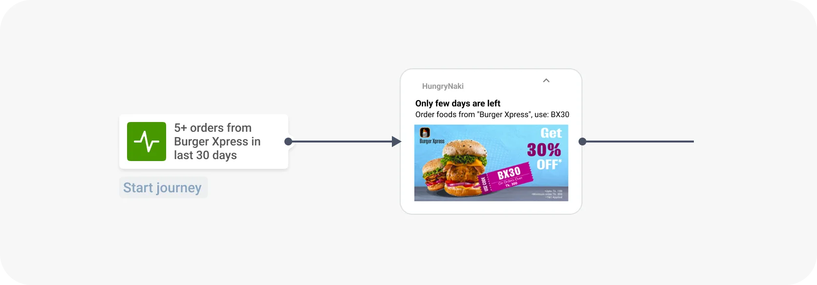
The result: users returned more consistently, improving user engagement, customer retention, and overall lifetime value.
Messaging effectiveness metrics → drive actions, not just sends
Effective messaging doesn’t just reach users — it drives them to act.
Four core metrics indicate whether your messages are not only seen but also acted upon: click-through rate (CTR), opt-in rates, opt-out rates, and conversion rates. These determine how relevant, timely, and persuasive your messaging is.
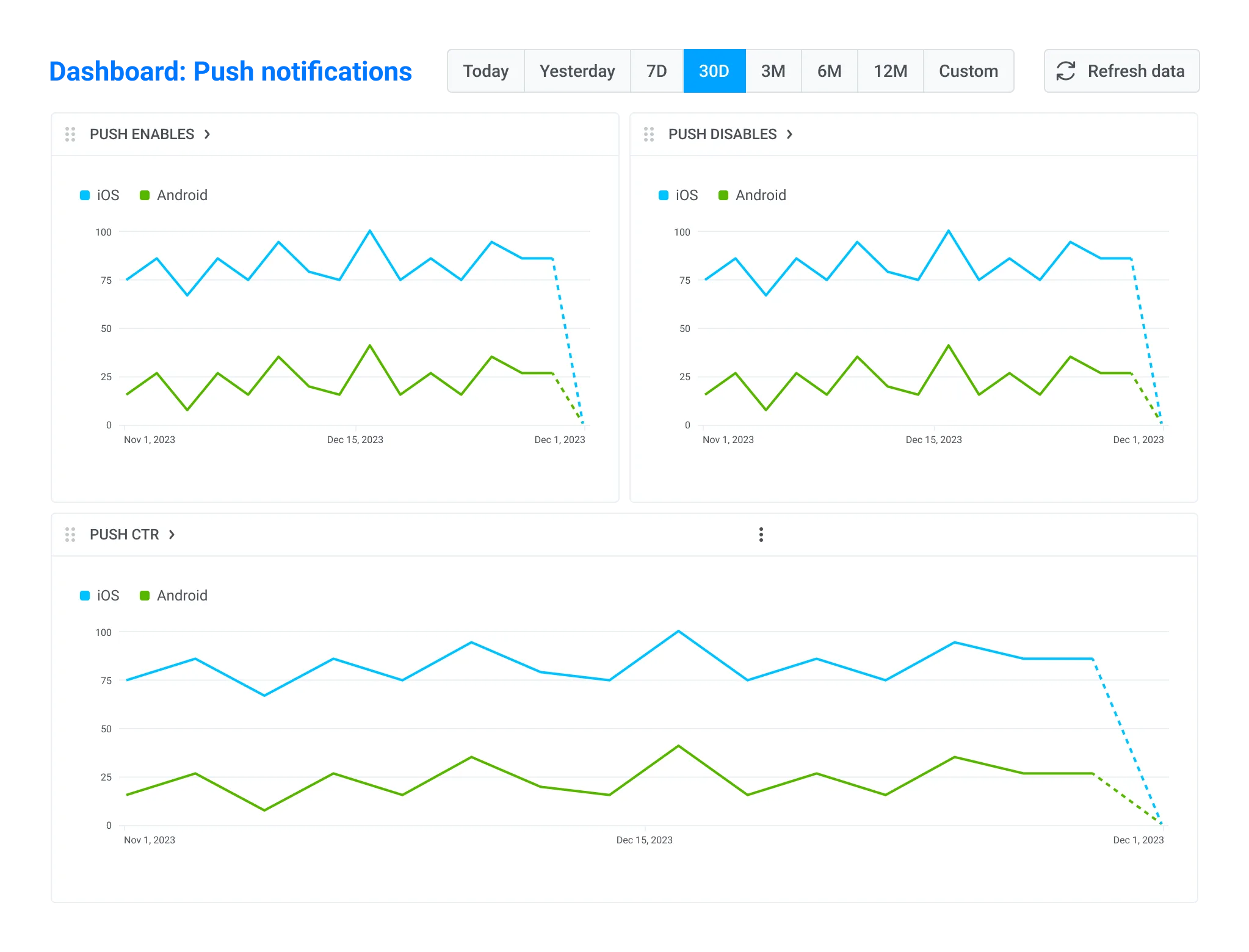
📊To track: In Pushwoosh, go to Statistics > Dashboards > Push notifications and monitor CTR, opt-in, opt-out, and conversion rates in real time.
💡Add an event (or several events) as a Conversion Goal in Pushwoosh, and the conversion rate will be displayed in your statistics dashboard as well.
CTR (click-through-rate)
CTR shows how many users tap your push notification, in-app message, email, or SMS after receiving it.
It’s your first signal of message performance: a high CTR means your message caught attention and triggered action, like opening the app, viewing a product, or reading an article. While not the final conversion metric, CTR strongly predicts engagement and downstream value. If users aren’t clicking, they’re not converting.
How to measure CTR
In Pushwoosh, CTR is measured automatically and can be accessed in two ways:
-
View the CTR of a specific message directly on the canvas in Customer Journey Builder.
-
Or check the Customer Journey Statistics panel on the left side of the journey canvas — it provides key performance insights for the entire campaign.
To calculate the percentage of users who clicked on your push notification after receiving it, Pushwoosh uses this formula:

Opt-in & opt-out rates
These two metrics reveal how open users are to hearing from you — and whether your messages make them want to stay or leave.
The opt-in rate indicates the percentage of users who allow notifications. To measure it, use this formula:

Getting permission is just the start — keeping it is what counts.
The opt-out rate measures the percentage of users who turn off notifications after opting in:

Together, they reflect your app’s reach and the relevance of your messaging. High opt-out rates could indicate frequency fatigue or misaligned content.
Conversion rate
Conversion rate tracks the percentage of users who complete a desired action after interacting with a message — for example, placing an order, completing onboarding, or upgrading to a paid plan.
It’s the most direct way to connect communication efforts with business outcomes. A high CTR is great, but conversion is where value is truly created.
How to measure conversion rate
There may be different formulas, but in the Pushwoosh dashboard, you will get your CR measure this way:

These “events” are defined by you — e.g., a successful checkout or onboarding step completed.
In Pushwoosh, you define your desired action as a Conversion Goal — e.g., a successful purchase or completed onboarding flow — and track performance automatically.
This approach is especially useful for e-commerce and subscription-based apps where messaging drives multiple types of actions across the funnel.
How to improve messaging effectiveness metrics
Best practice: Real-time messaging based on user behavior and location
Our recent study shows that segmentation plays a crucial role in driving engagement. For instance, location-based segmentation can boost CTR by up to 15x, while interest-based targeting can drive 10x better engagement.
The key is to tailor your messaging based on these specific user attributes and behaviors — and trigger it at the right moment, to the right audience.
Real example: 4–7% conversion rate & $2,400+ revenue from a single push
Telepizza, the world’s leading Mediterranean pizza delivery company, used Pushwoosh to launch automated push campaigns that triggered at just the right moment.
They set up customizable push notifications for specific geozones via API, alerting customers to local offers as soon as they entered a defined area (usually 300–500 meters from a restaurant).
A message like “Pizza of the week for a special price” appeared at the perfect time and place, increasing visibility and driving action.
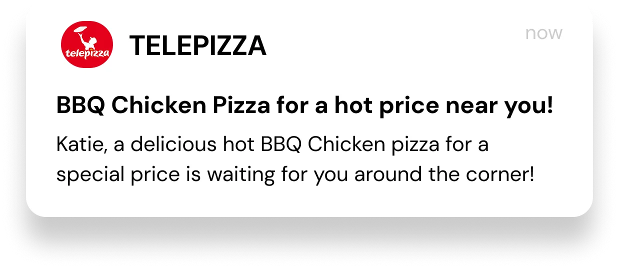
Result: This location- and behavior-based strategy delivered conversion rates of 4–7% (with an average of 0.8%), 300–450 completed orders, and $2,400–$3,600 in revenue, while also improving customer loyalty.
User satisfaction metrics → build loyalty through better experiences
These metrics reflect how users feel about your app — and whether they’re likely to continue using it, recommend it to others, or uninstall it altogether. Monitoring satisfaction metrics helps you catch early warning signs of churn and improve the overall user experience.
Uninstall rate
This metric indicates the number of users who delete your app after installing it. A sudden spike — especially after onboarding or specific messages — often signals friction or unmet expectations.
To measure the uninstall rate, use this formula:

Uninstalls are a critical signal: they not only reduce your user base but may also reflect poor messaging timing, irrelevant content, or product issues.
📊 To track: In Pushwoosh, go to Statistics > Dashboards > Application and monitor uninstalls in real time, or use your mobile analytics tools (like Amplitude, Mixpanel, Piano, or UXCam).
Net Promoter Score (NPS)
NPS reflects how likely users are to recommend your app to others. It measures overall sentiment and loyalty, helping you identify both advocates and detractors.
How to measure NPS:
Ask: “How likely are you to recommend this app to a friend or colleague?”
They respond on a scale from 0–10 and are grouped as:
- Promoters (9–10)
- Passives (7–8)
- Detractors (0–6)

Use NPS feedback to identify product strengths, pain points, and user trends.
App rating
This is your app’s public score in the App Store and Google Play — a powerful indicator of satisfaction, trust, and visibility.
How to measure app ratings
App rating = Average of user-submitted star scores (typically 1–5 stars). You can monitor your app rating directly in Google Play Console or App Store Connect.
Higher ratings improve store ranking and download rates, while low ratings can reflect usability issues, bugs, or poor communication.
How to improve user satisfaction
Best practice: Ask for feedback at the right time — and act on it
Proactively request reviews, ratings, or NPS scores after a positive experience — like completing onboarding, placing an order, or receiving a reward. Timing matters: poorly timed prompts can annoy users or result in low scores.
Combine in-app messages with behavior-based triggers in Pushwoosh to prompt happy users for feedback and redirect unhappy users to support channels instead.
Want more engaged users? Start here — with Pushwoosh
You now know which user engagement metrics to measure and have an idea of how to improve them.
Pushwoosh equips your team with all the tools to run effective campaigns and turn engagement metrics into business success. Sign up now to improve your user engagement metrics with Pushwoosh solutions.