Every day, millions of users open mobile apps — and leave within seconds. The challenge isn’t getting downloads; it’s keeping users engaged, guiding them to value, and converting them into loyal customers. In-app messages are one of the most powerful tools available to meet that challenge head-on.
Unlike push notifications that reach users outside the app, in-app messages are contextual, targeted communications delivered directly within your mobile app or website while a user is actively engaged. They require no external opt-in and can be tailored to appear at precisely the right moment in a user’s journey.
In this comprehensive guide, you’ll learn what in-app messages are, why they matter, the different types available, how to build an effective in-app message strategy, and see real-world examples across the entire customer lifecycle — all powered by the Pushwoosh platform.
What are in-app messages?
In-app messages are notifications or interactive content displayed directly within a mobile application or website while the user is actively using it. Unlike push notifications, they don’t interrupt the user when the app is closed — instead, they appear contextually, as part of the in-app experience itself.
Key characteristics of in-app messages:
- Contextual: triggered by specific user actions, behaviors, or lifecycle stage
- Non-disruptive: delivered while the user is already engaged in the app
- Permission-free (in most cases): no OS-level opt-in required, unlike push notifications
- Versatile: can take the form of announcements, tutorials, surveys, promotional offers, or onboarding flows
- Real-time: delivered instantly based on user events or predefined conditions
From a business standpoint, in-app messaging serves as a direct communication channel to guide users, deliver value, and drive meaningful actions — all without leaving the app environment. Whether you’re running an e-commerce platform, a fintech app, a mobile game, or a media product, in-app messages are a cornerstone of any effective in-app marketing strategy.
Why are in-app messages important? Benefits & value
The benefits of in-app messages extend across the entire customer lifecycle. Below are the four core value pillars, mapped to Pushwoosh’s Engage → Retain → Earn framework.
Boost user engagement
In-app messages keep users active and interacting with your app’s core features. By surfacing the right information at the right moment — a feature tip, a content recommendation, a contextual prompt — you dramatically increase the depth and frequency of engagement. This maps directly to Pushwoosh’s Engage use case: onboard, activate, inform, and communicate with your audience via any available channel.
Drive user retention
Retention is the lifeblood of any app business. In-app messages help reduce churn by proactively re-engaging at-risk users, guiding them back to features they haven’t explored, and delivering value before they lose interest. Pushwoosh’s Customer Journey Builder and RF(M) segmentation make it possible to identify users at risk of churning and target them with precisely timed retention messages.
Increase conversions & revenue
In-app messages are a direct revenue driver. Targeted upsell prompts, limited-time offers, cart abandonment reminders, and subscription upgrade nudges all influence purchase decisions at the moment of highest intent — when the user is already in the app. This is the Earn use case: driving revenue through in-app purchases, upgrades, and conversions.
Enhance user experience
Because in-app messages are contextual and non-interruptive, they enhance rather than disrupt the user experience. Personalized guidance, timely support messages, and relevant content delivered at the right moment make users feel understood — increasing satisfaction, trust, and long-term loyalty.
Types of in-app messages
In-app messages come in a variety of formats, each suited to different communication goals and user experience contexts. Understanding the main types helps you choose the right format for every situation.
Modal in-app messages
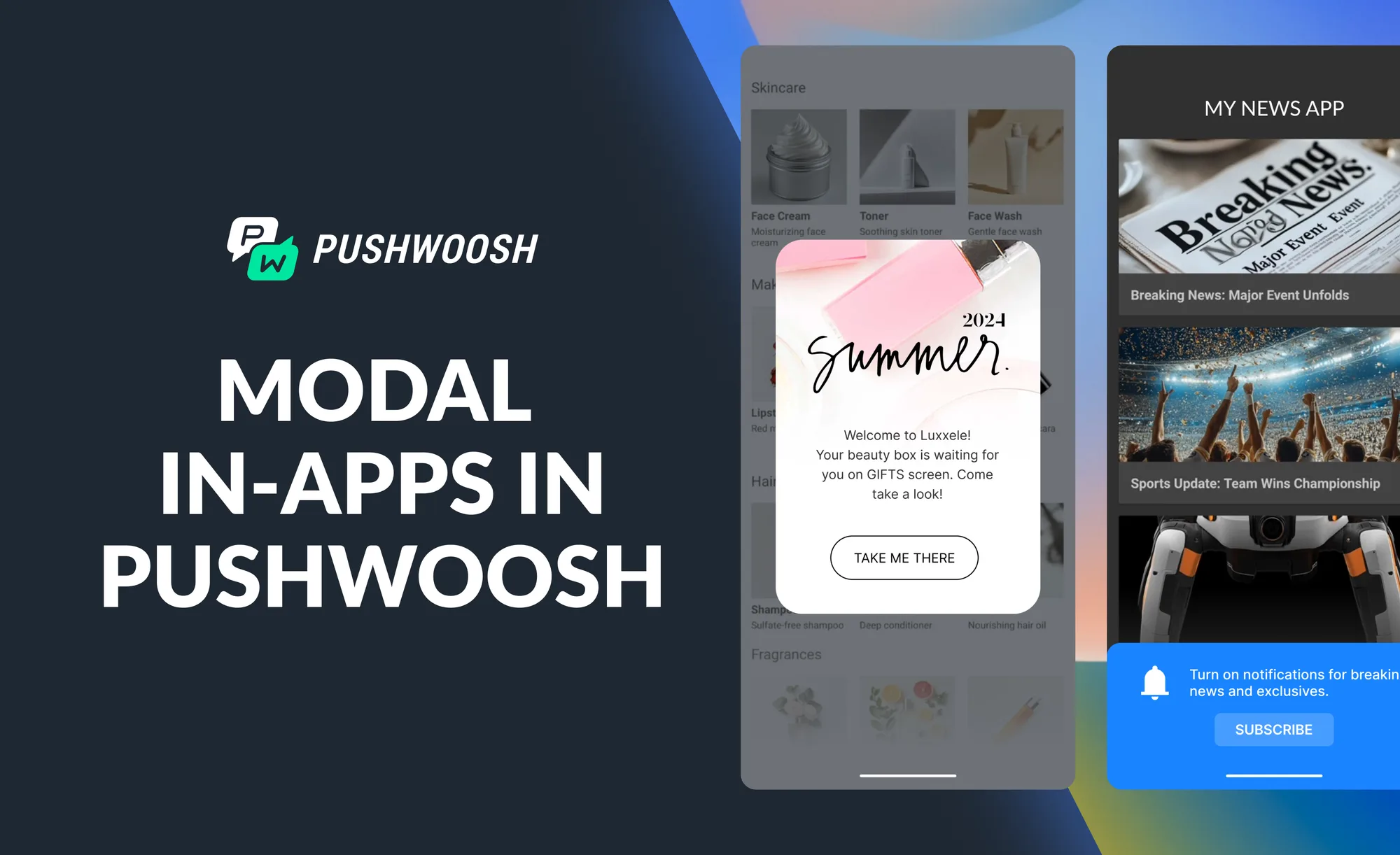
Modal messages appear as a pop-up overlay in the center of the screen, requiring the user to take an action (accept, dismiss, or respond) before continuing. They command full attention and are ideal for critical information, permission requests, onboarding steps, survey prompts, or urgent announcements.
Typical use cases: consent forms, trial expiration notices, NPS surveys, important feature updates.
Banner in-app messages
Banners appear at the top or bottom of the screen and are non-interruptive — users can continue using the app while the banner is displayed. They are perfect for low-urgency alerts, promotional hints, or feature announcements that don’t require an immediate response.
Typical use cases: new feature teasers, promotional announcements, soft upsell prompts, status updates.
Full-screen in-app messages
Full-screen messages take over the entire display, delivering maximum visual impact. They are best used for high-stakes moments: first-time onboarding, major product announcements, seasonal promotions, or gamified experiences.
Typical use cases: onboarding splash screens, major sale announcements, welcome offers, special events.
Survey/feedback in-app messages
These messages embed a question or short survey within the app interface to collect user opinions, satisfaction scores, or product feedback. They are invaluable for understanding user sentiment without redirecting users outside the app.
Typical use cases: NPS collection, app store rating prompts, post-transaction feedback, feature preference surveys.
In-app messages vs. push notifications: what’s the difference?
Both in-app messages and push notifications are essential tools in mobile marketing — but they serve different purposes and work best in different contexts. Understanding their differences helps you build a complementary, holistic engagement strategy.
| Factor | In-app messages | Push notifications |
|---|---|---|
| Delivery | Inside the app, while user is active | Outside the app, even when closed |
| Opt-in required? | No OS-level permission needed | Yes — user must opt in |
| Interruption level | Low — contextual, non-disruptive | High — interrupts any activity |
| Primary goal | Onboarding, guidance, conversion in-app | Re-engagement, time-sensitive alerts |
| Rich media | Yes — full-screen, modals, carousels | Limited — text + image |
| Best for | Feature adoption, upsells, feedback | Win-back, reminders, breaking news |
The most effective mobile engagement strategies use both channels together: push notifications bring users back into the app, while in-app messages guide them toward value once they’re inside. For example, Pushwoosh customer AvaTrade increased account registrations by 12% by combining in-app messages with push notifications for new users.
How do in-app messages work? Strategy & implementation
Understanding how to trigger, plan, and personalize in-app messages is fundamental to building campaigns that convert. Here’s how in-app messaging works in practice.
Triggering & delivery
In-app messages are activated by specific triggers set in your messaging platform. Common trigger types include:
- Event-based: app open, feature used, button tapped, purchase completed
- Behavior-based: session length, number of app opens, specific page visited
- Segment entry: user meets a defined criteria (e.g., inactive for 7 days, completed onboarding)
- Time-based: X days after install, after a specific date
Pushwoosh’s SDK provides 10 default events out of the box (such as PW_DeviceRegistered) and supports custom events, giving teams full control over when and how messages are shown.
Planning your in-app message strategy
Before building messages, define your strategy:
- Goal: What action do you want the user to take? (complete onboarding, upgrade, leave a review)
- Audience: Who should see this message? (new users, power users, lapsed subscribers)
- Content: What is the value proposition? Be concise and direct.
- Timing: When in the user journey does this message have the highest relevance?
- Frequency: How often can a user see this message before it becomes annoying?
Segmentation & personalization
The most effective in-app messages are personalized. Using Pushwoosh’s Tags/Events system and RF(M) segmentation, you can target users based on behavior, lifecycle stage, preferences, and purchase history. The Customer Journey Builder lets you map out multi-step communication flows with segment splits — for example, showing different messages to users who started a free trial vs. those who skipped it entirely.
Dynamic content personalization allows you to insert user-specific data (name, last action, account status) directly into message copy, making every message feel individually crafted.
How to create in-app messages with Pushwoosh
Here are four steps to get your in-app messages live quickly and effectively.
1. Identify and target the right users automatically
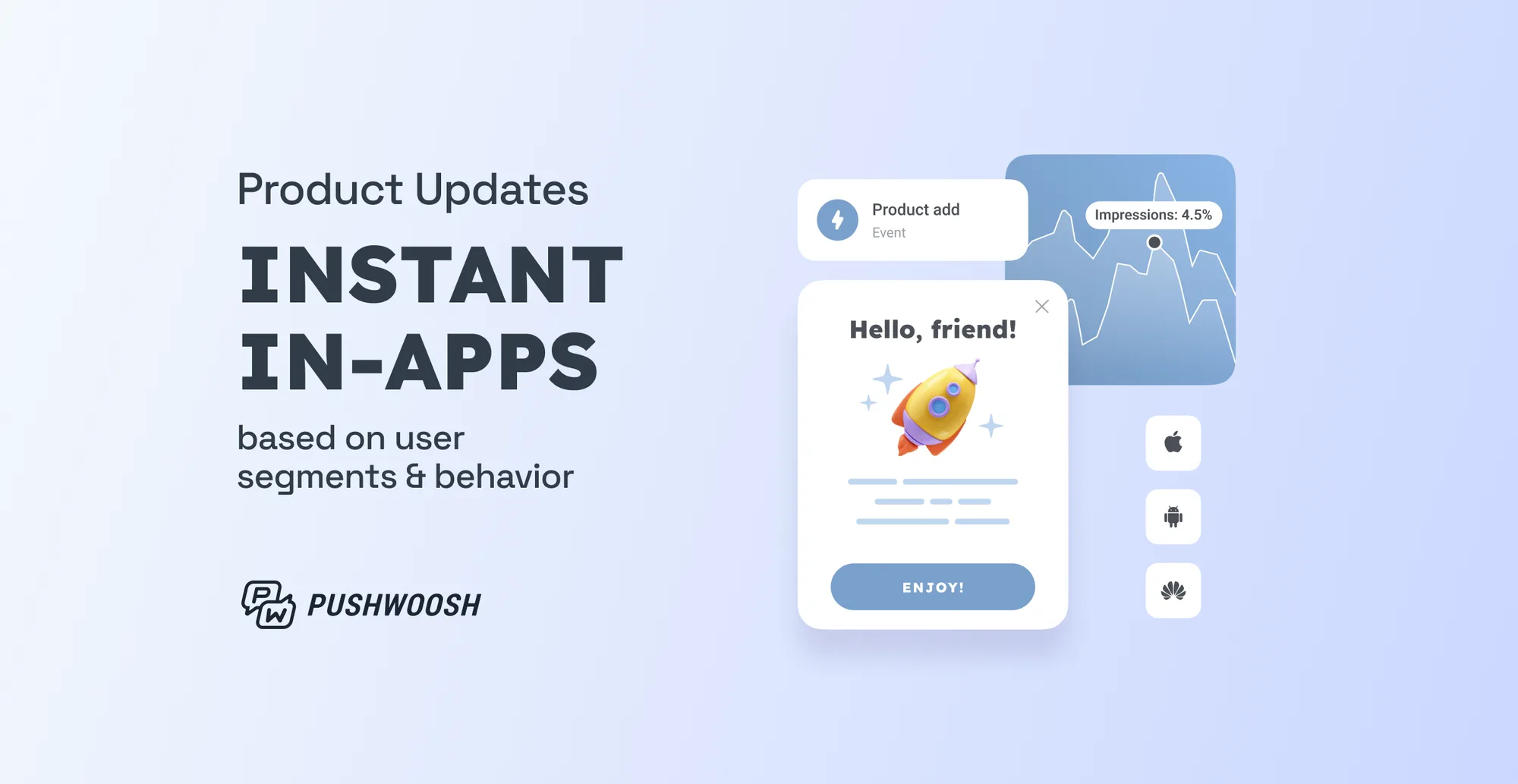
After you install the Pushwoosh SDK, you gain access to ten default events that help you segment your users. One of these events is PW_DeviceRegistered, which allows you to identify users who have recently downloaded your app. You can equally target users based on any custom event — a purchase, a feature interaction, or a segment entry — enabling you to deploy any type of in-app message.
2. Design a segmented communication campaign
Boost the effectiveness of your in-app messages by implementing segmentation and personalization tactics. In the Customer Journey Builder, you can:
- Identify users who have activated a free trial;
- Distinguish users who did not start their free trial.
Customize your in-app messages for these two distinct user groups. Users who activated the trial may be more receptive to tips and tricks, while users who skipped the trial may respond to a special offer.
3. Launch in-app messages in no time
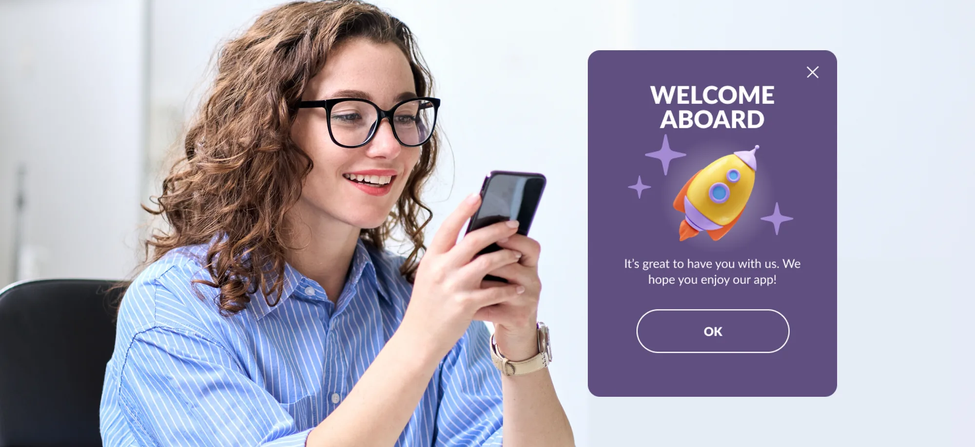
Create in-app messages using Pushwoosh’s ready-made templates (including the Welcome Aboard template). Adjust them to suit your needs. You can design your message to appear at the top, bottom, or center of the screen using modal rich media settings, ensuring it doesn’t interfere with UX. No development team required.
4. Uncover insights and improve performance
Evaluate the performance of your in-app messages on two levels:
- Overview: Right on the Customer Journey Builder canvas, get a quick glance of the goals reached and drop-offs.
- Detailed analysis: The in-app statistics report provides an in-depth review of impressions, interactions, audience, and more.
By leveraging these insights, you can enhance your messages and conduct A/B/n tests to optimize the performance of your in-app flow.
Best in-app message examples across the customer journey
In-app messages are effective at every stage of the customer lifecycle. Below are examples mapped to Pushwoosh’s Engage → Retain → Earn framework, including detailed breakdowns from leading mobile apps.
Onboarding & welcome messages (Engage)
💡 Real result: Bantoa, a shopping app, achieved a 28% improvement in user activation using Pushwoosh welcome in-app messages — successfully registering users who had downloaded the app but never completed registration.
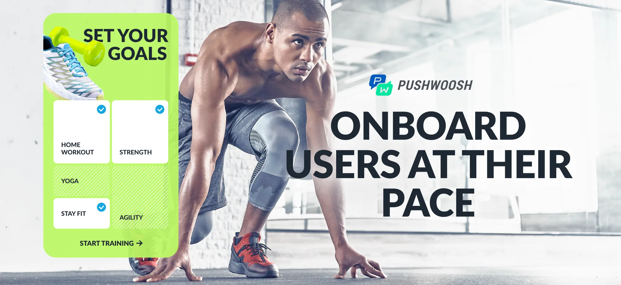
Welcome and onboarding in-app messages are the first impression your app makes after install. Their job is to set expectations, demonstrate core value, and guide users toward their first key activation action.
Best practices for onboarding messages:
- Use a friendly, conversational tone to make users feel valued from the start
- Highlight core benefits — communicate how the app solves a specific problem
- Show one concept at a time to avoid overwhelming new users
- Use a progress indicator so users know where they are in the sequence
- Give users the option to skip if they prefer to explore on their own
- Trigger off PW_DeviceRegistered to automatically target brand-new installs
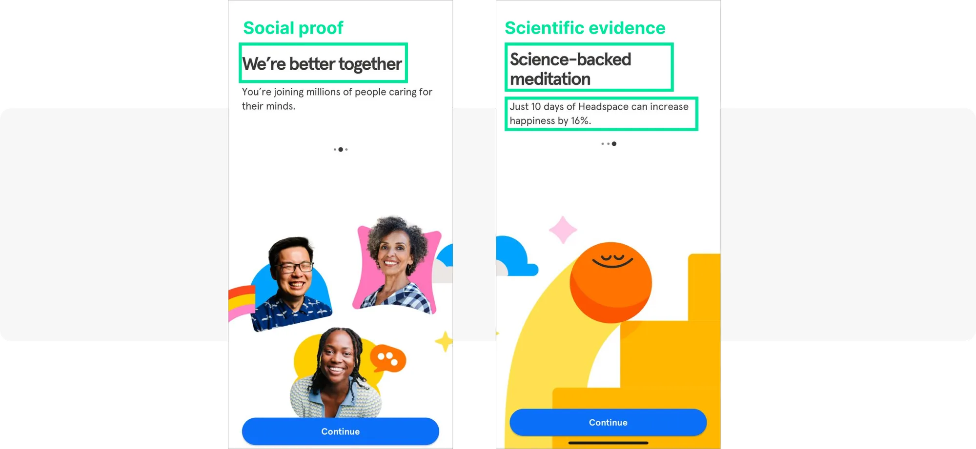
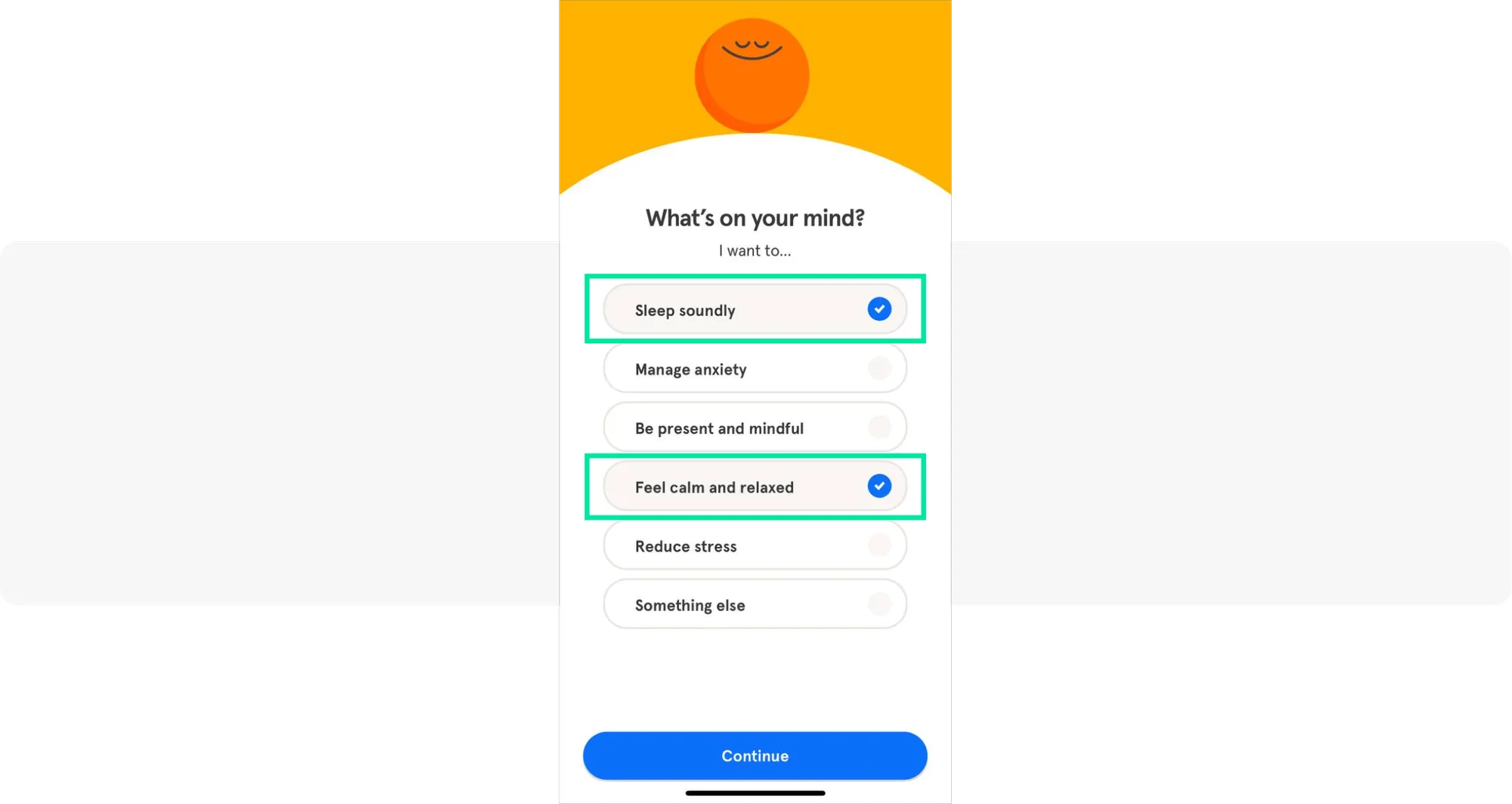
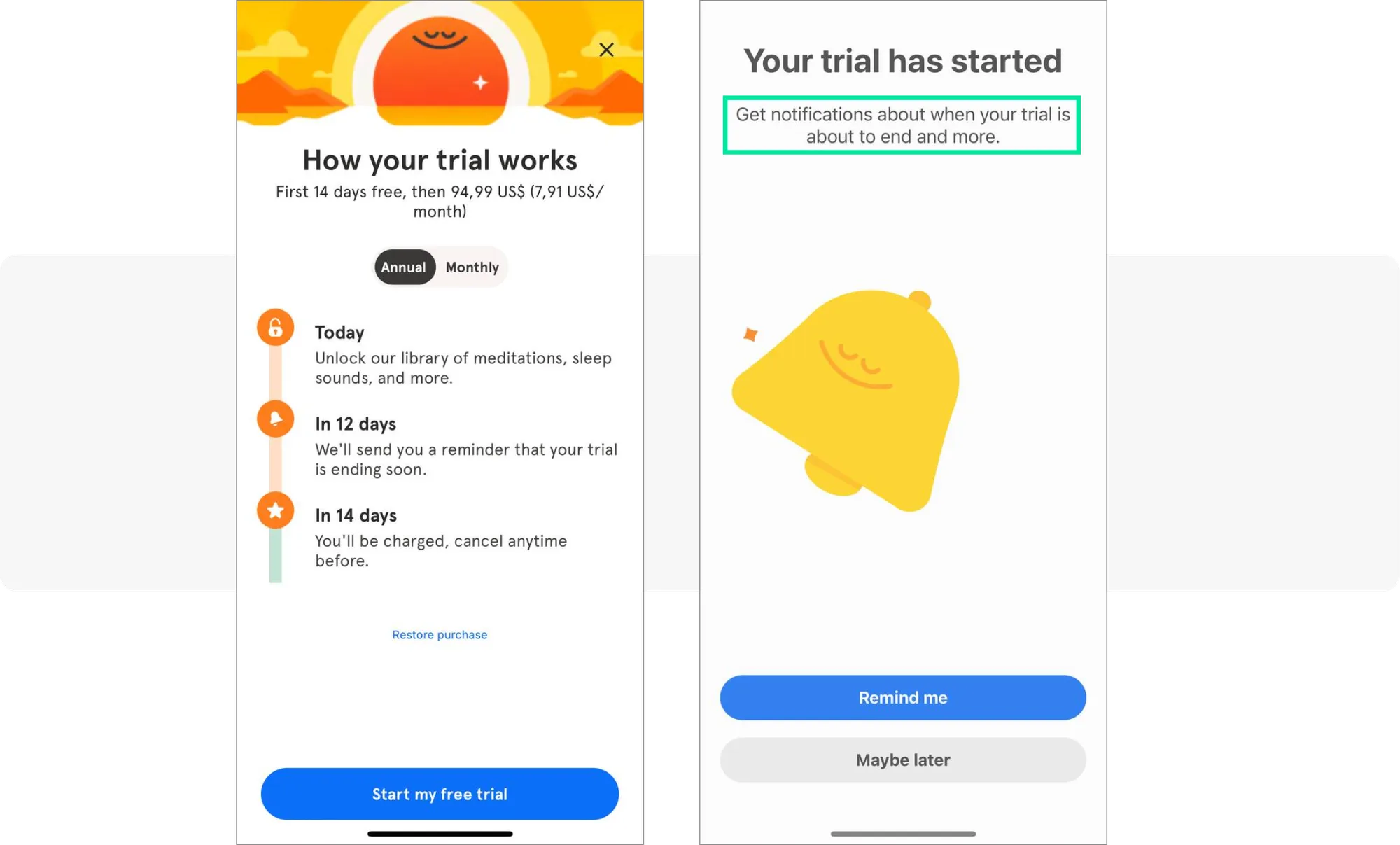
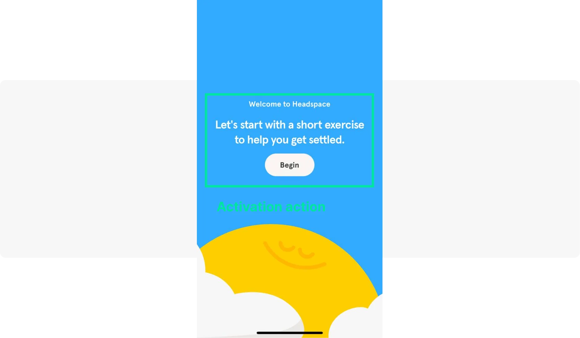
Headspace: Uses social proof (“Join millions of users caring for their minds”) and scientific authority to build credibility immediately. It collects user preferences to personalize the experience, introduces a paywall at a strategic moment, and explains clearly why notifications are needed. The activation goal: complete a first meditation session.
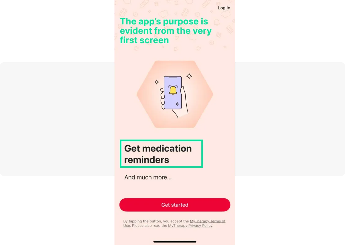
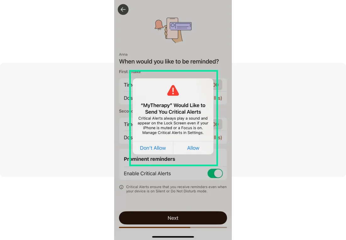
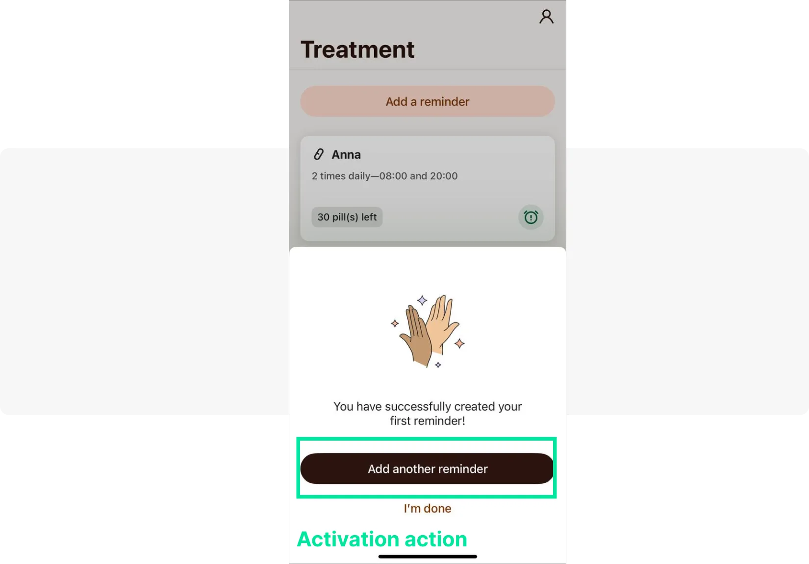
MyTherapy: Leads with its primary value proposition (medication reminders) and explains exactly why notifications are needed. The activation action is creating a first reminder — simple, concrete, and directly tied to the app’s core utility.
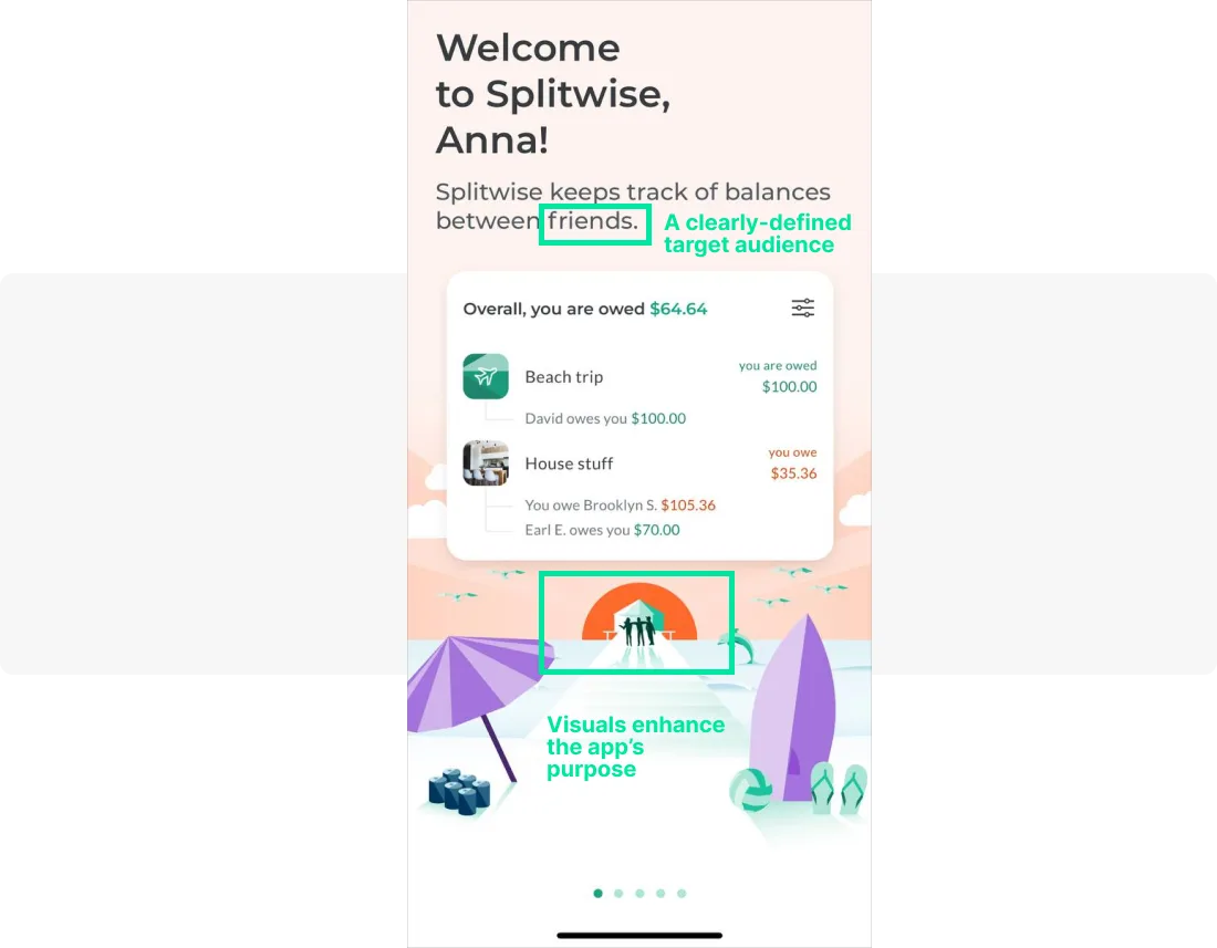
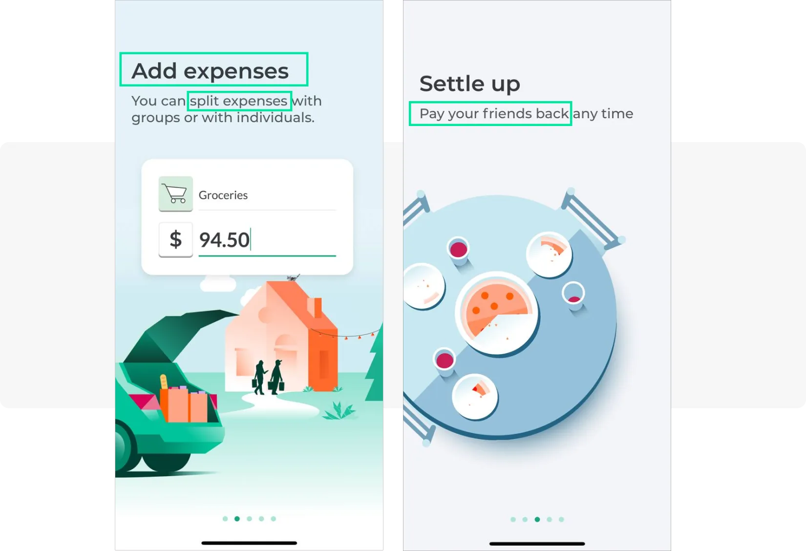
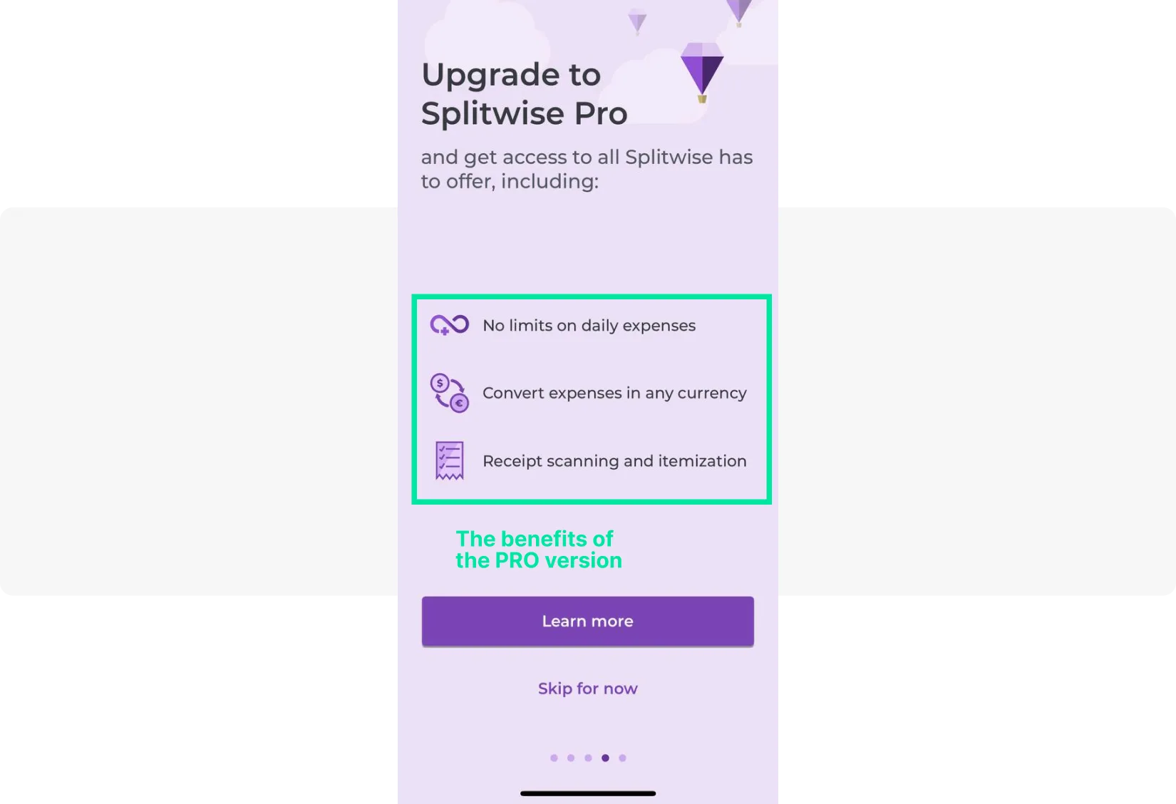
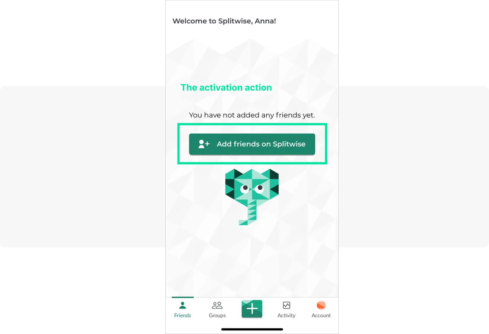
Splitwise: Uses imagery that instantly communicates the app’s purpose (friends sharing expenses). It presents one feature per screen, introduces a paywall at a natural moment, and drives activation by prompting users to add friends.
Feature adoption & education (Engage)
Feature adoption messages help users discover and use capabilities they haven’t explored yet. These are critical for reducing churn caused by users not realizing the app’s full value.
Example (mobile game): After a user’s third session, display an in-app banner: “Did you know you can join a guild? Team up and earn 2× rewards.” CTA: “Join a Guild Now.” This surfaces a social feature that dramatically improves long-term retention.
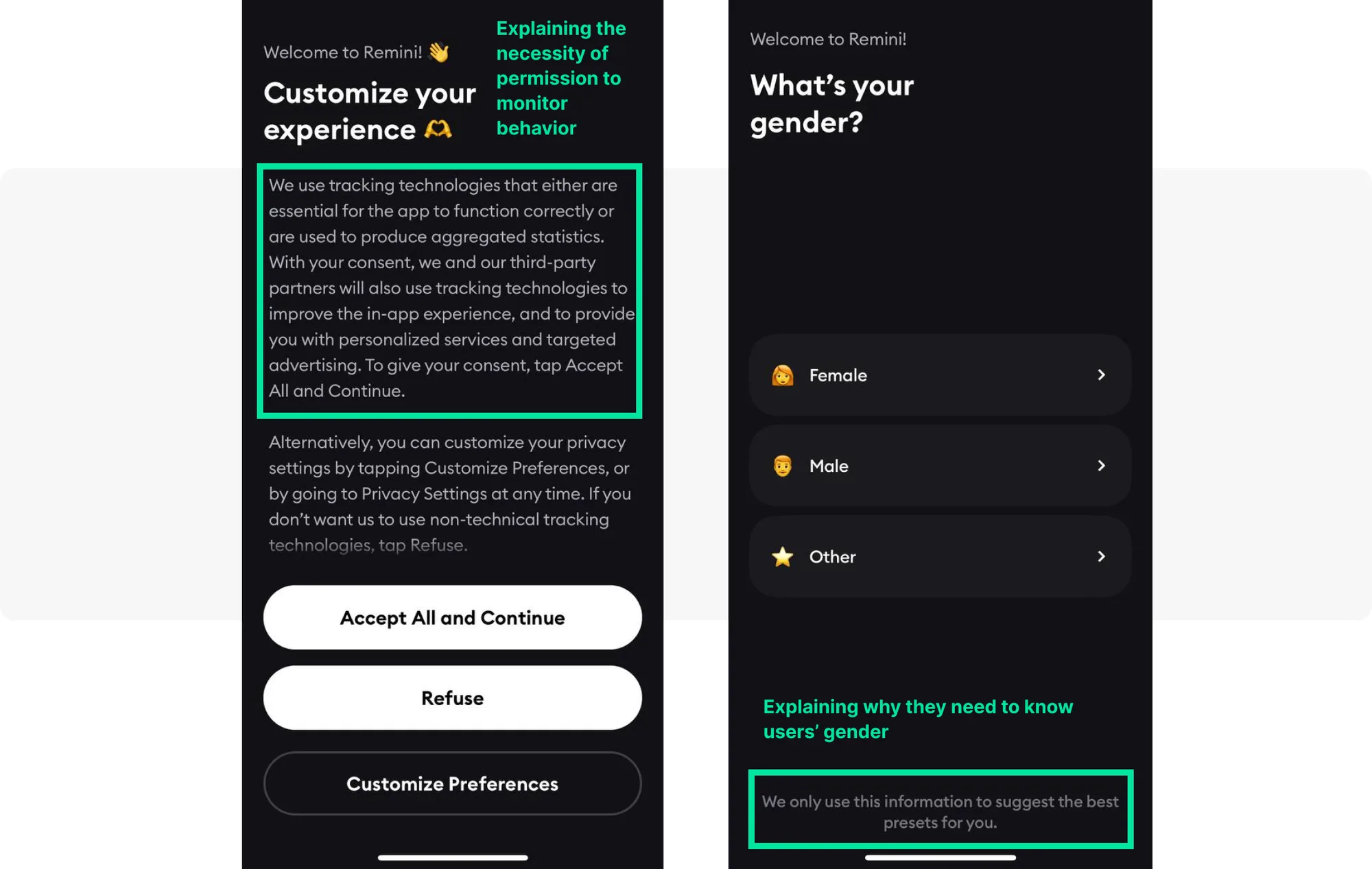
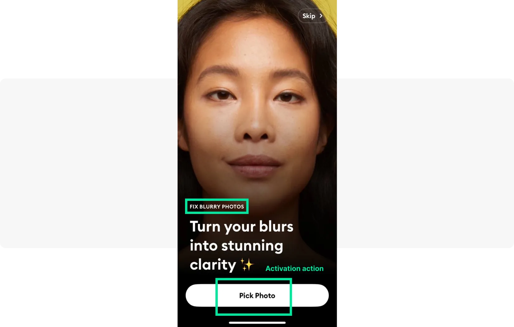
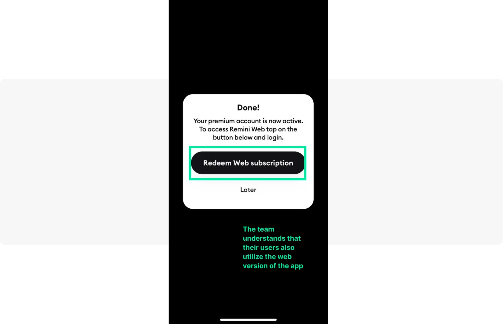
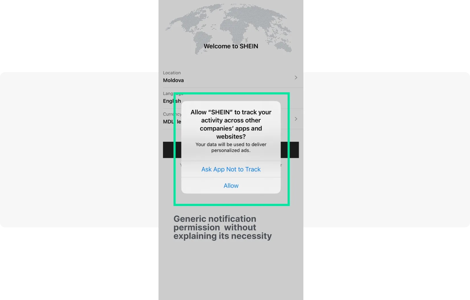
Remini: Puts users in control from the first screen — explains tracking technologies, asks users to select their gender with a clear rationale (“this will enhance your experience”), then asks users to choose a blurry photo to process immediately, letting them see the app’s value in real time.
Retention & reactivation (Retain)
Retention messages target users who are at risk of churning — those who haven’t opened the app in a defined number of days, haven’t returned to a key feature, or whose subscription is about to lapse.
Example (fintech app): A user hasn’t checked their portfolio in 14 days. Trigger an in-app message on next open: “Your portfolio is up 8% this week! Tap to see what moved.” This combines personalized data with an emotional hook to re-engage at exactly the right moment.
Monetization & upselling (Earn)
Monetization messages are most effective when they appear at high-intent moments — after a user has experienced core value, during a session where they’re actively engaged.
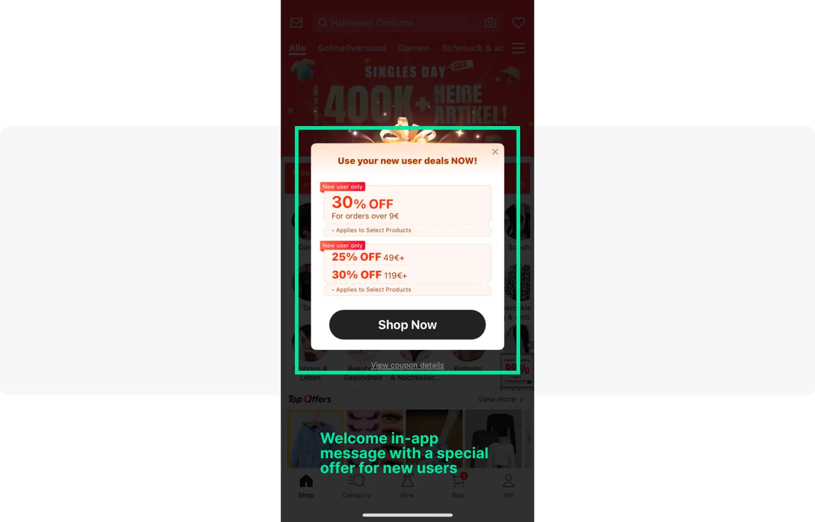
Shein: Offers up to 30% off on the first purchase with a visually striking message immediately after onboarding — capitalizing on peak engagement while motivation is high.
Splitwise: Presents the pro version upgrade at a natural point in the onboarding flow, clearly listing premium features that enhance the experience of a task the user is already trying to complete.

Surveys & feedback (Retain)
Survey messages collect actionable insights without requiring users to leave the app. Timing is critical: trigger them after a positive experience for higher response rates.
Example (news app): After a user reads 5 articles in a session, trigger a compact in-app modal: “How would you rate your experience today? ⭐⭐⭐⭐⭐” with a one-tap rating. Follow up users who rate 4–5 stars with an App Store review prompt.
Best practices for effective in-app messages: building a winning strategy
Whether you’re sending a welcome message, a re-engagement prompt, or a conversion offer, the following best practices apply universally to all in-app messaging campaigns.
Clear call-to-action (CTA)
Every in-app message should have one clear action for the user to take. Ambiguity kills conversions. Use action-oriented language (“Start Free Trial”, “See My Offer”, “Explore Feature”) and make the primary CTA visually prominent. Secondary actions (like “Not now” or “Remind me later”) should be present but de-emphasized.
Personalization & relevance
The era of one-size-fits-all messaging is over. Use Pushwoosh’s behavioral segmentation (Tags/Events) and RF(M) segmentation to deliver messages that reflect each user’s individual context — their history, preferences, current session behavior, and lifecycle stage. A personalized in-app message consistently outperforms a generic broadcast in both engagement and conversion metrics.
Include social proof where relevant — testimonials, user statistics, or ratings build trust and credibility, particularly for new users evaluating your app.
Timing & context
Show in-app messages at moments of highest relevance. A retention message shown to a user who just completed a purchase is poorly timed; the same message shown 7 days after their last session is highly relevant. Map your message triggers to specific moments in the user journey where they add genuine value.
Always give users the option to dismiss a message and explore the app on their own terms.
Concise & engaging content
In-app messages are not emails. Keep copy short and punchy — a modal message should communicate its value proposition in 1–2 sentences. Use high-quality visuals and brand-consistent design to reinforce the message. Incorporate appealing graphics and icons to make the experience aesthetically pleasing and immediately clear.
A/B testing & optimization
Never assume your first version is the best version. Use Pushwoosh’s A/B/n testing to experiment with different headlines, body copy, CTAs, timing, and message formats. Even small improvements — a 5% lift in CTA click rate, for example — compound significantly at scale. Document your learnings and iterate continuously.
Include limited-time promotions or special offers strategically — urgency can dramatically increase conversion rates, but should be used authentically and sparingly.
Respect user experience
Frequency and timing matter as much as content. Over-messaging trains users to dismiss or ignore messages — and in extreme cases, leads to app uninstalls. Set frequency caps per user, honor dismissal preferences, and always give users a clear way to close a message. The goal is to add value, not to pressure.
Be transparent: when requesting permissions (location, notifications, biometrics), explain clearly why you need them and how they benefit the user. Transparency builds trust and reduces drop-off during onboarding.
Robust analytics & reporting
Track key in-app message metrics: impressions, interaction rate, conversion rate, and downstream impact on retention and revenue. Pushwoosh’s analytics dashboards and in-app statistics report provide both high-level overviews and granular per-message data. Use these insights to identify top-performing campaigns and replicate their success across your broader in-app message strategy.
Choose the right in-app messaging platform: Pushwoosh’s solution
Implementing a high-performing in-app messaging strategy requires the right platform. Pushwoosh is a comprehensive customer engagement platform built for mobile-first teams, offering everything you need to create, automate, and optimize in-app messages at scale.
Key Pushwoosh capabilities for in-app messaging:
- No-code in-app message builder with ready-made templates (modal, banner, full-screen)
- Customer Journey Builder for trigger-based, multi-step communication flows
- Behavioral segmentation via Tags/Events and RF(M) segmentation
- Dynamic content personalization — insert user-specific data into every message
- A/B/n testing — experiment with any message element and optimize based on results
- Real-time analytics dashboards with impressions, interaction rates, and conversion tracking
- AI campaign creation and optimization via ManyMoney AI
- Cross-channel orchestration: in-app messages, push notifications, email, SMS, WhatsApp — all in one platform
Whether you’re a mobile game looking to increase in-app purchases, a fintech app focused on activation, or an e-commerce platform driving repeat conversions, Pushwoosh provides the tools to make every in-app message count.
Master your in-app messaging strategy with Pushwoosh
A well-executed in-app message strategy is one of the most powerful levers available to mobile marketers. From onboarding new users and driving feature adoption to re-engaging inactive customers and unlocking revenue — in-app messages deliver value at every stage of the customer lifecycle.
The key is to move beyond one-off messages and think in terms of a coherent in-app messaging strategy: the right message, to the right user, at the right moment. That means advanced segmentation, behavioral triggers, personalized content, continuous A/B testing, and robust analytics.
Pushwoosh’s in-app messaging platform gives you all of these capabilities in one place — whether you’re building welcome sequences, retention flows, or monetization campaigns.


