The median marketing email gets clicked by 6.81% of the people who open it (MailerLite). So out of every 100 readers interested enough to open, 93 scroll, skim, and close.
Most of those emails look alike: a stock hero, a centered “Shop now” button, a footer copied from the last campaign. Nothing is broken, but nothing is worth a tap, either.
This guide shows how to make your email actually stand out. We’ll go block by block, from hero to footer, through the email design best practices that get the click.
Why most emails look the same
Scroll any email design inspiration gallery and the best examples share 1 thing: every block was designed for that specific email. Most inbox traffic works the other way around, for 3 reasons.
- Email HTML is hard to build. Email still runs on table-based layouts and inline styles, and a design that looks right in Gmail can fall apart in Outlook. So anything beyond the default template means a developer and a round of testing. Most teams take the stock layout, change the logo, and ship.
- Stock visuals. The hero image is picked to fit any campaign, which means it fits none. It’s the first thing the reader sees, and it says nothing about the offer.
- No design system. There’s no single place for brand colors, fonts, and the footer, so every campaign gets styled by hand. A few months in, no 2 emails look quite the same.
The cost of these mistakes shows up after the open. The subject line did its job, and the reader opened the email. Then they closed it without a click, because it looked like every other email in the inbox and nothing caught their eye.
How do you make your email actually stand out?
The short answer: better design. The longer one: fine-tune every block of the email so it looks relevant and personal to the reader, and gives them a real reason to click and do what you need from them, whether that’s buying, booking, or coming back to the app.
And no, that doesn’t mean a developer or designer has to rewrite HTML for every email.
Now let’s go block by block: how you can improve each part of the email to get more clicks.
Email design best practices, block by block
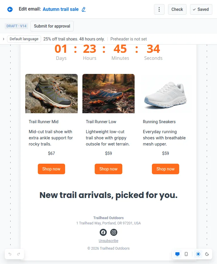
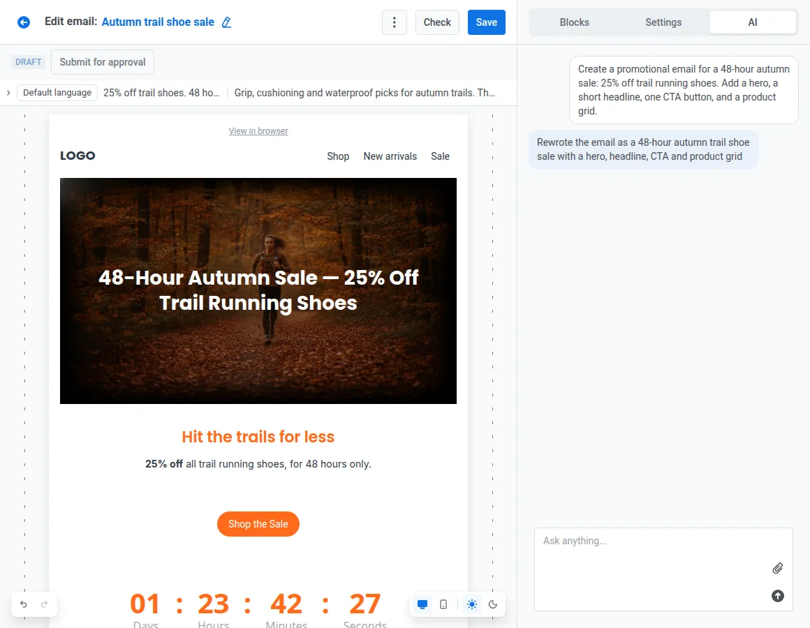
Here’s the email we’ll take apart: an autumn sale from a running gear app, 48 hours, 25% off trail shoes, built in Pushwoosh’s drag-and-drop editor.
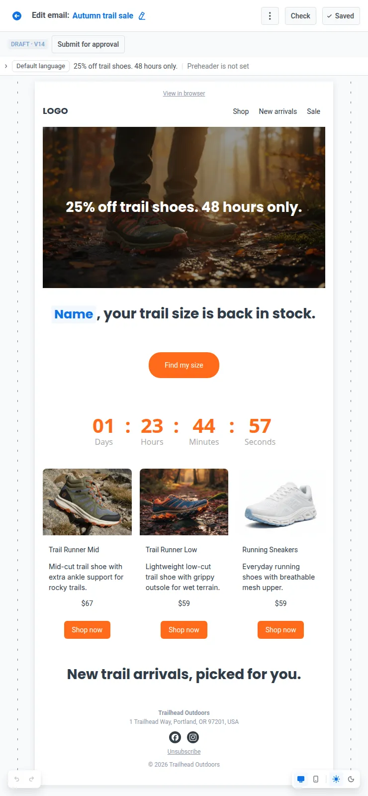
The email breaks down into 5 blocks. Here’s what makes each one stand out and what it changes for the reader.
| Block | How to stand out | Effect |
|---|---|---|
| Header | A compact header on 1 brand system: Brand book with Derive brand, saved as a synced block | Instant recognition, same look in every email |
| Hero | A visual built around the offer with Generate with AI, headline kept as live text | The reader gets the offer at first glance |
| Copy & CTA | A headline written for 1 reader with merge tags and Liquid, and 1 styled live-text button | Relevance and 1 clear next step |
| Content | Product grids from the live catalog, audience-specific sections with display conditions, a countdown with the Timer block | More product clicks, the right offer for each reader, urgency to act now |
| Footer | 1 footer saved as a synced block, checked by Smart check | Legal details stay correct in every email |
Below, we open up each block through its practices, from the top of the email to the bottom: why each practice works, and how to implement it in Pushwoosh.
Top of the email: header & hero
#1. Build the header on your brand system
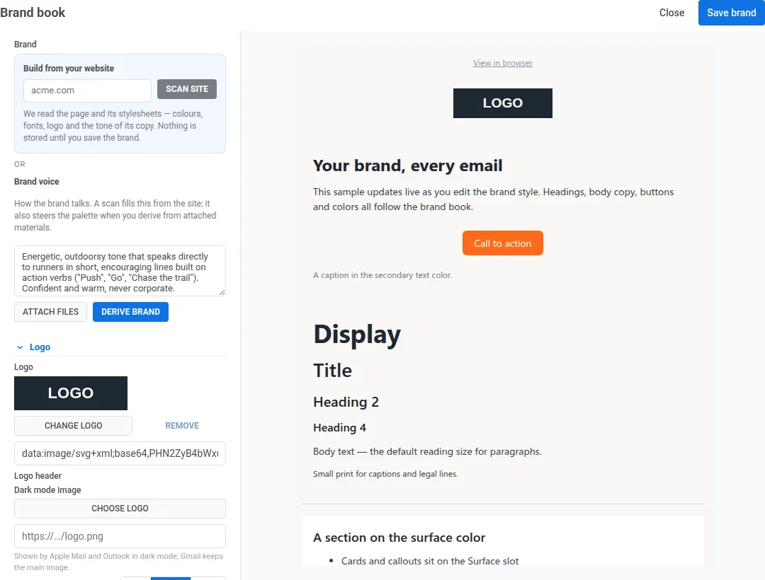
Why it works: The header opens every email. When the logo, colors, and fonts look the same every time, readers recognize the sender at a glance, and every block below inherits the same look.
Instead of: colors copied from the last email and a new header layout for every campaign → try: 1 brand system and a compact header (logo plus 2 or 3 links), identical in every email.
In Pushwoosh: Set up the Brand book: logo, colors, fonts, block defaults, and brand voice. You don’t have to fill it in by hand: Derive brand scans your website, a brand-book PDF, or your logo and proposes the palette, fonts, and tone. Apply brand book styles repaints any template, older ones included, without touching the content.
Then build the header with your logo and a Menu block, and save it as a reusable block with Keep copies in sync on, so a new menu link shows up in every email at once. The footer works the same way (see practice 8).
#2. Build the hero around the offer, not a stock photo
Why it works: The hero is what the reader sees before deciding whether to scroll. If it shows the offer, they get the point in 1 glance.
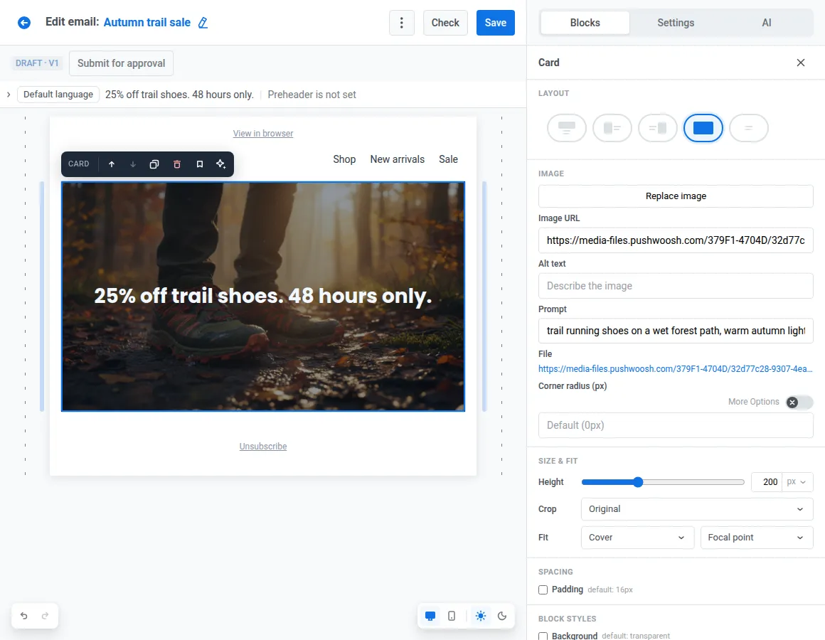
Instead of: a smiling runner from a stock library → try: the actual trail shoes on sale, with “25% off trail shoes. 48 hours only.” as live text on top.
In Pushwoosh: In the Image block, Generate with AI creates the visual from a prompt (“trail running shoes on a wet forest path, warm autumn light”) in a 16:9 banner ratio. Place it as the background of a Card block, and the headline and button stay live text: they still show when images are blocked, and screen readers can read them.
The body: copy, CTA, and content
#3. Write a personalized headline for each reader
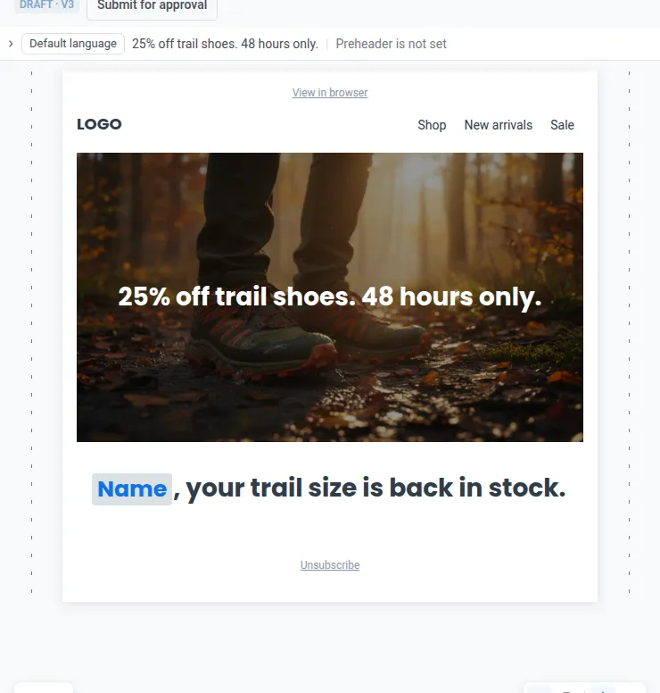
Why it works: A headline that names something the reader recognizes (their name, their size, the category they browsed) reads as a message to them, not a broadcast.
Instead of: “Check out our autumn collection” → try: “Anna, your trail size is back in stock.”
In Pushwoosh: Insert the name as a merge tag from the Heading toolbar and set a default value, like “Runner”, for readers without a name on file. For a different line by language or country, use Liquid templates.
#4. Give every email 1 CTA that clearly stands out
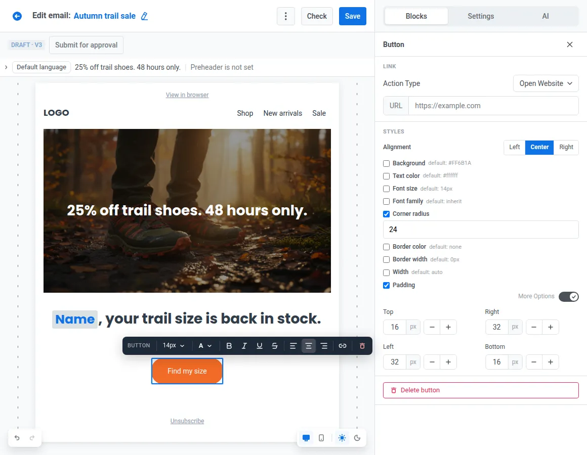
Why it works: Every extra button splits attention. 1 primary CTA in a contrasting color tells the reader what to do next, and on a phone it needs a tap target of at least 44×44 pt, per Apple’s Human Interface Guidelines.
Instead of: 3 equal buttons (“Shop now”, “Learn more”, “View all”), or a button baked into an image → try: 1 live-text button, “Find my size”, in your accent color.
In Pushwoosh: Style the Button block with a solid or gradient background, corner radius, and padding, and set larger mobile padding so the button stays thumb-sized.
#5. Fill product grids from live data
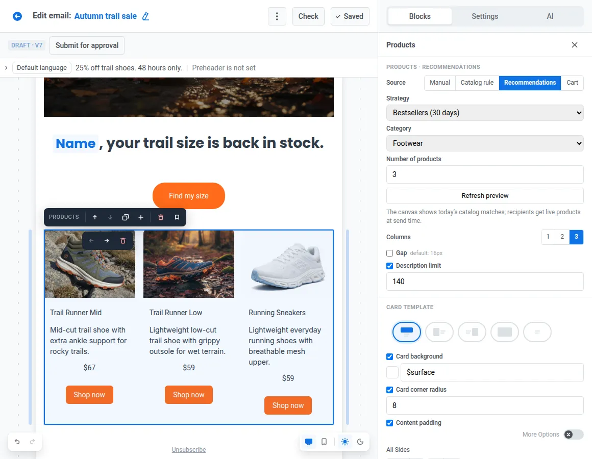
Why it works: Sold-out items and outdated prices cost clicks and trust.
Instead of: 6 shoes copied into the template on Monday, 2 of them sold out by Thursday → try: a grid of trail shoes based on what each reader viewed, pulled from the live catalog.
In Pushwoosh: The Products block fills items by catalog rule, from the recipient’s abandoned cart, or with a recommendation strategy like bestsellers, back in stock, or based on what they viewed. Your Product catalog feed syncs hourly, so prices and stock stay current without anyone editing the email.
For media and content apps, the News block does the same with articles from your feeds, with AI-written intros under each headline.
#6. Give each audience its own section
Why it works: A loyal member and a customer who hasn’t ordered in 3 months need different reasons to click.
Instead of: the same “new collection” pitch for everyone → try: 1 section with 3 variants: early access for loyalty members, 25% off for anyone inactive for 90+ days, and new arrivals for everyone else.
In Pushwoosh: Add a display condition to each variant, based on Tags or a Liquid expression, and chain them with IF / ELSE IF / ELSE. 1 campaign to build and QA, 3 different emails in the inbox.
#7. Make urgency concrete with a countdown
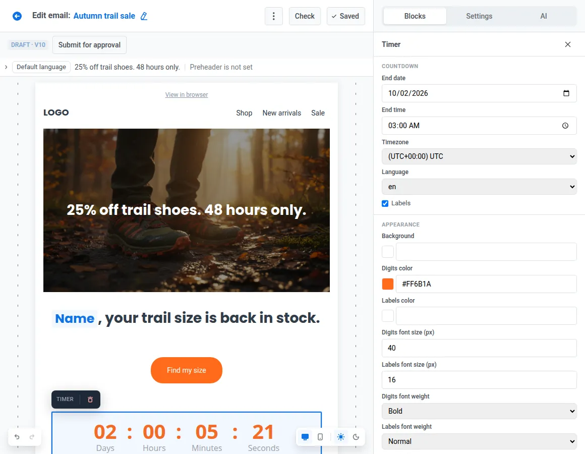
Why it works: “Soon” is abstract. A visible deadline turns “maybe later” into a decision the reader has to make now.
Instead of: “Sale ends soon!” in the subject, the headline, and the button → try: a countdown to the actual end of the 48-hour sale, placed right next to the CTA.
In Pushwoosh: Drop in the Timer block, set the end date, time, and timezone, and style the digits in brand colors. Running an offer that’s redeemed in-store instead? The Barcode block renders a scannable code for each recipient.
The bottom: footer
#8. Build the footer once and keep it in sync everywhere
Why it works: The footer carries the unsubscribe link, the postal address, and legal text. It has to be right in every email.
Instead of: a footer copy-pasted from campaign to campaign until there are 2 versions of the legal text → try: 1 footer, updated in 1 place.
In Pushwoosh: Build 1 footer in brand styles, with the unsubscribe link, postal address, and social links, and save it as a reusable block with Keep copies in sync on. Edit the address once, and every email that uses the footer updates, including emails already scheduled to send.
Tip: Smart check flags a marketing email with no postal address in the footer, and warns you when an email passes Gmail’s ~102 KB clipping limit, where the footer is the first thing to get cut.
Speed up email design with AI tools
A standout email doesn’t have to take a week. These AI tools (note: available for every Pushwoosh user) cut the production time and help improve the design.
AI assistant
Describe the email in the AI tab, and the assistant assembles a full email for you.
I remember when drag-and-drop functionality was a game changer for email creation. Now, AI-powered creation feels like the next level.
I describe the goal, the message, the links, and the images, and thanks to the Brand Book incorporated in Pushwoosh, I get an email that’s almost ready to send.
All that’s left is to test it, add it to the Customer Journey Builder, and launch. I use the journey builder even for one-off email campaigns, as it gives me a much clearer view of the whole email logic, especially with complex segments.
It’s a real time-saver, without compromising on quality.

AI images and alt text
Generate with AI creates a visual from a text prompt, right in the Image block. Generate alt with AI writes the alt text from the image itself.
AI subject lines and preheaders
Once the content is built, 1 click drafts a subject line and preheader from what’s actually in the email.
Auto-translate
Missing language versions get filled in by AI, instead of typing each language by hand.
Brand book & synced blocks
Styles, header, and footer from practices 1 and 8 mean nobody rebuilds the basics for a new campaign.
Build your 1st standout email
-
Start from a template or a prompt.
A layout from the email templates library, or a first draft from the AI assistant.
-
Apply your brand book.
Brand styles and a synced header: practice 1.
-
Walk the email top to bottom.
Hero, headline, CTA, products, audience sections, countdown, footer.
-
Design the mobile version.
Don't let the desktop layout just shrink onto a phone. Switch to mobile view, which is fully editable at real phone width, and choose Stack, Keep row, or Reverse for every Columns row. Set mobile-specific font sizes, padding, and image geometry, and use Hide on mobile or Hide on desktop for blocks that only make sense on 1 screen. That's responsive email design without writing a single media query.
-
Test.
Run Smart check, then send a test email to up to 50 addresses.
-
Send, then read the click map.
The Click map tab draws a heatmap over the email preview, so you see which elements pulled clicks and whether the new hero did its job.