In-app messaging is one of the best ways to reach users while they’re inside your app. The usual solution has always been the classic HTML in-app editor. It’s great for custom, complex designs, but heavy for the fast tests and hypotheses that a marketing manager runs day-to-day.
Now, native in-app messages give marketers full autonomy. You pick a ready layout right in the editor, personalize it, and launch in a few minutes, without the help of a designer or dev team.
This guide covers what native in-apps are, how to personalize them, and choose the right layout for the job — onboarding, conversion, winback, and retention.
📖 New to the channel? Start with what in-app messages are and why they work.
What is a native in-app message?
There are 2 ways to build an in-app message.
A classic HTML in-app is a custom web page the SDK shows as an overlay on top of your native UI, with full design control and a web render. It’s the right call when you need something the ready layouts can’t do, e.g., a feedback or survey form, interactive custom content, or a fully bespoke design you upload as a ZIP.
A native in-app is different: the SDK draws it with the platform’s own components from a ready layout you fill in the editor — no HTML, no web view. It opens faster, animates smoother, and looks like part of the app itself.
7 native in-app types and when to use each
Pushwoosh gives you 7 native layouts right in the in-app editor. So how do you know which one to reach for?
The choice of a layout is really an interruption question: how much of the screen, and how much of the user’s attention, does this message deserve right now? Answer that 1st, and the layout picks itself.
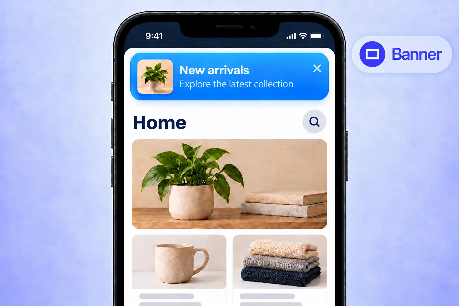
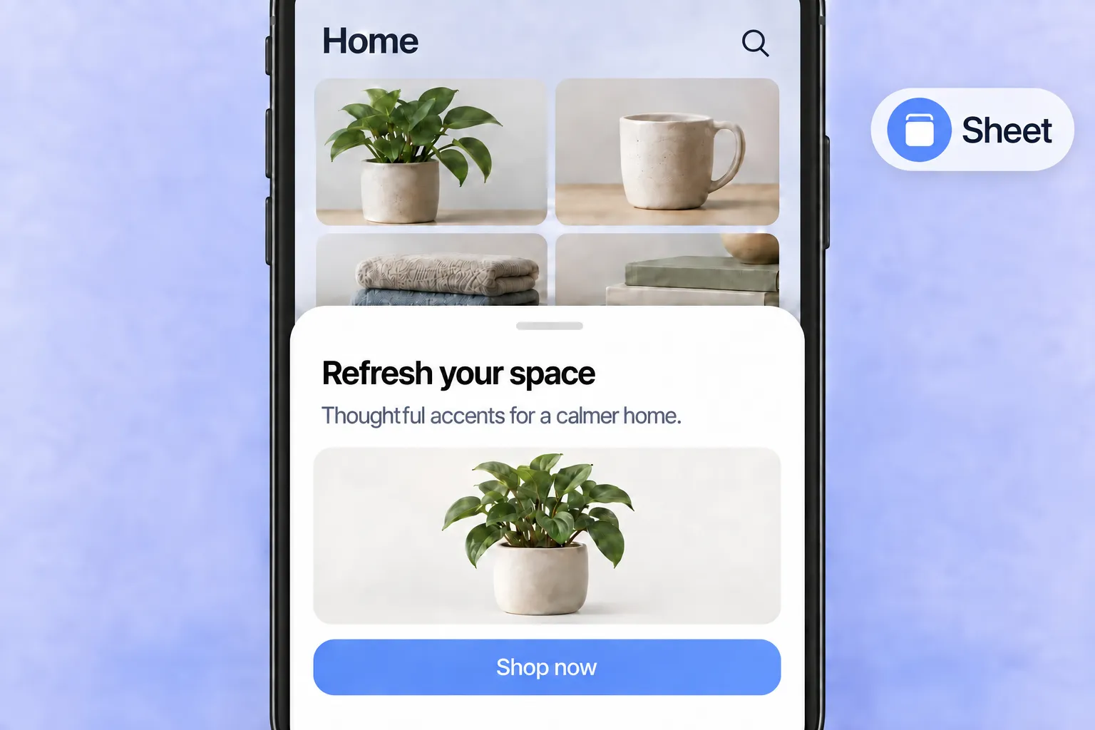
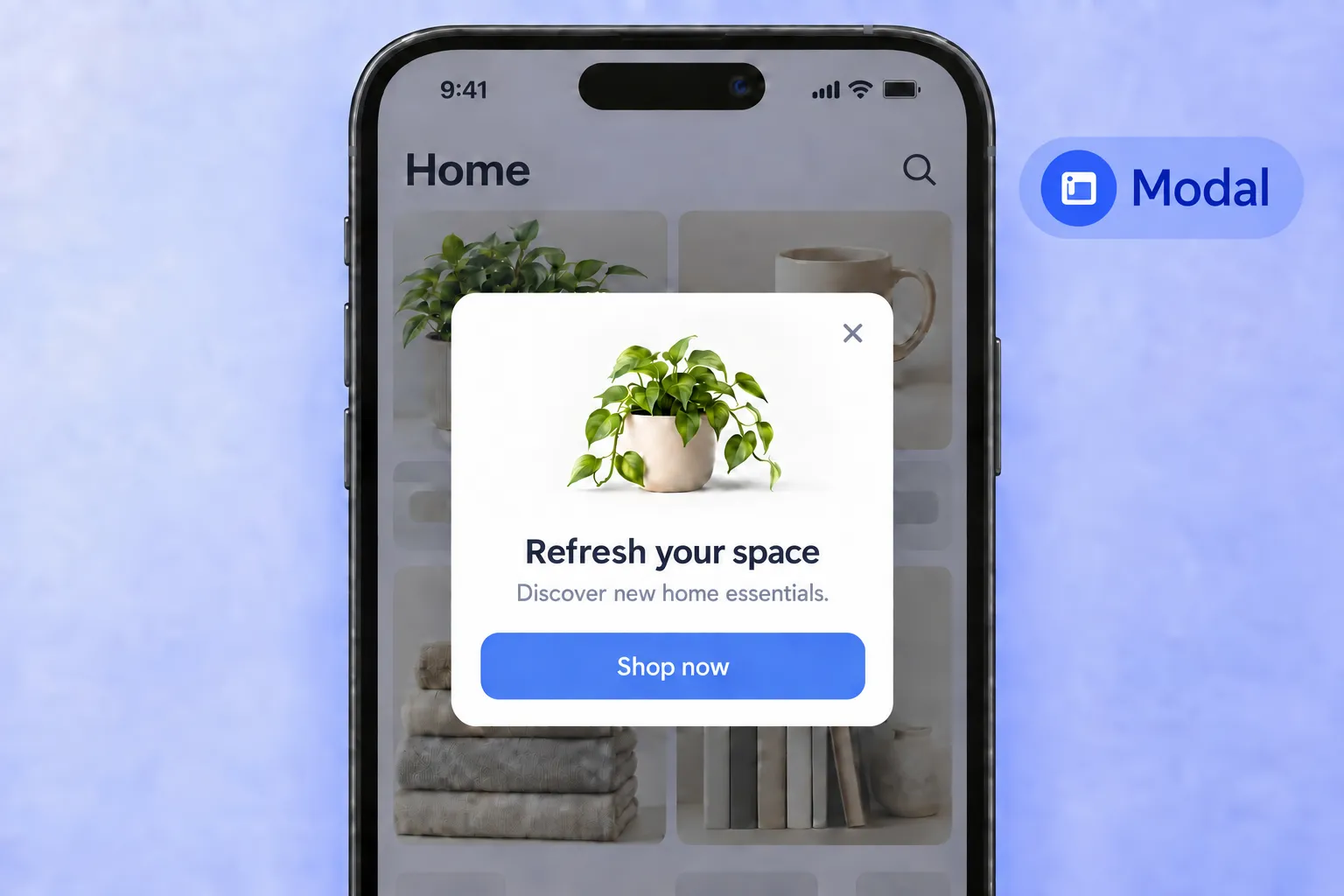
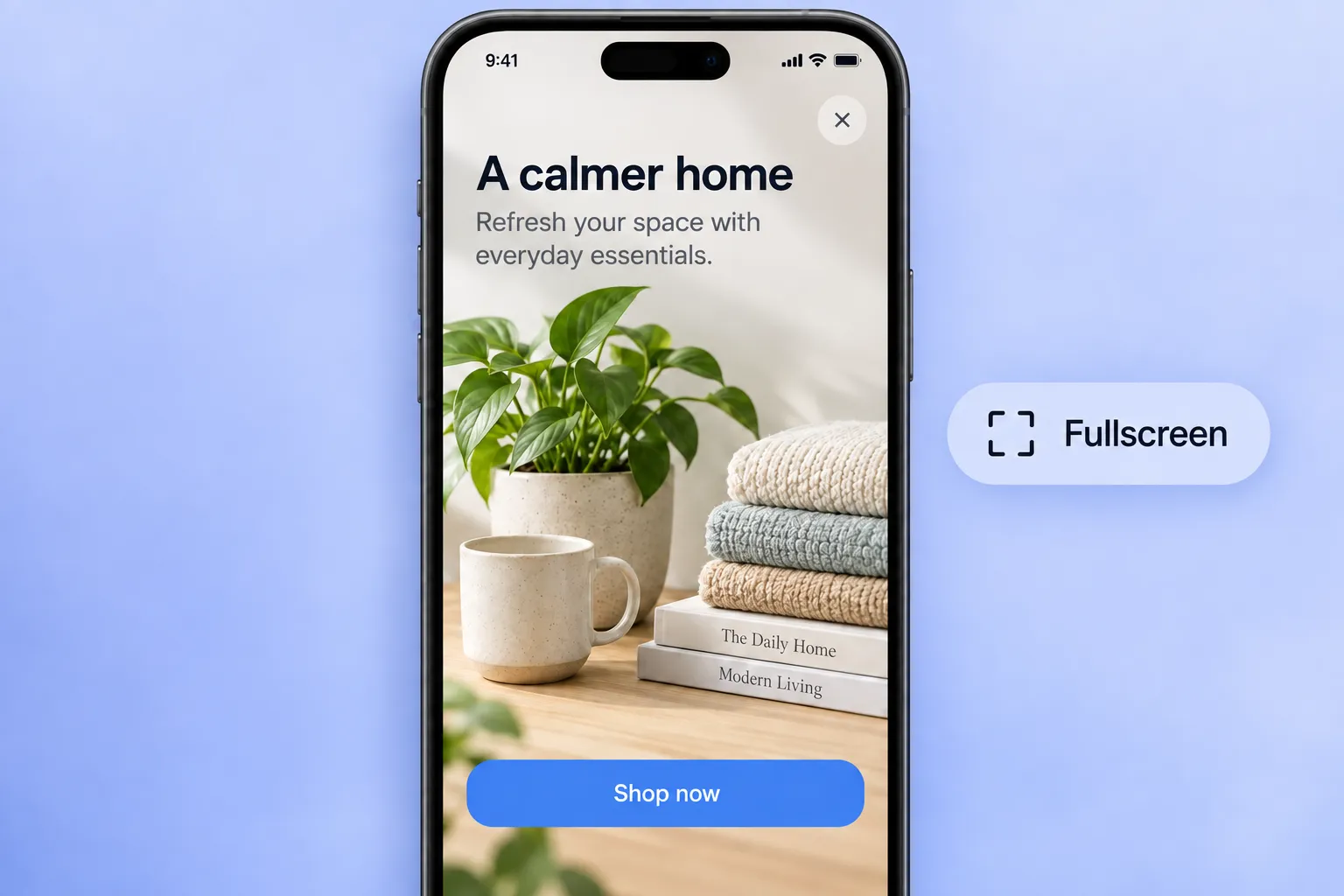
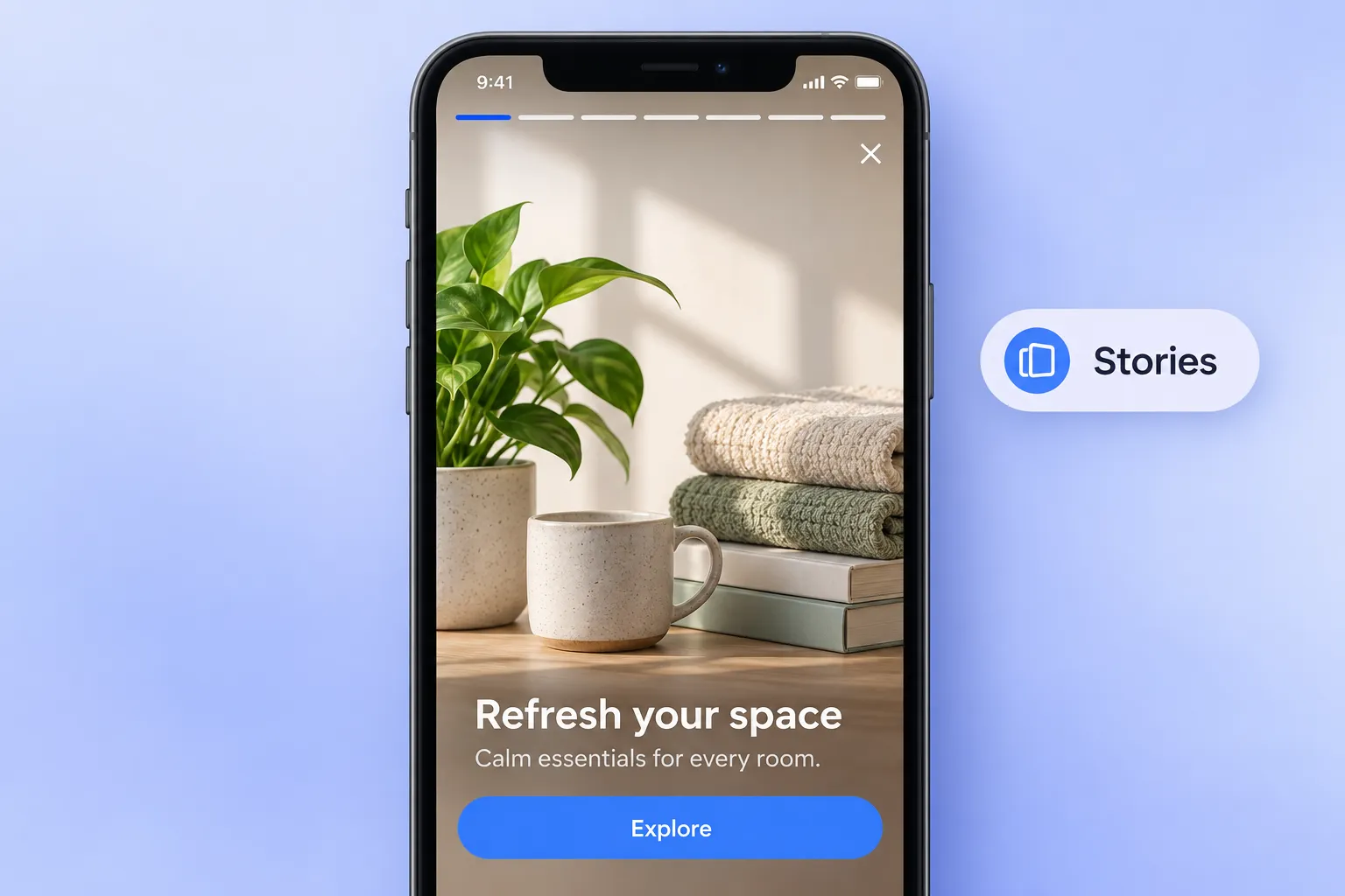
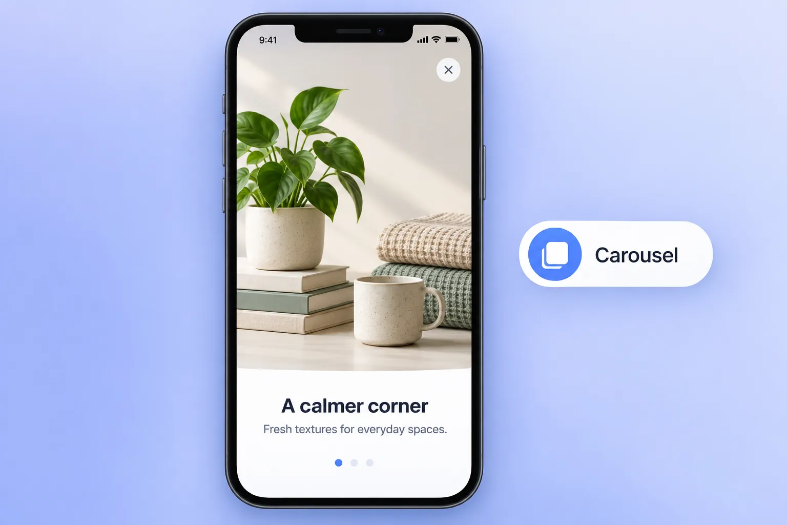
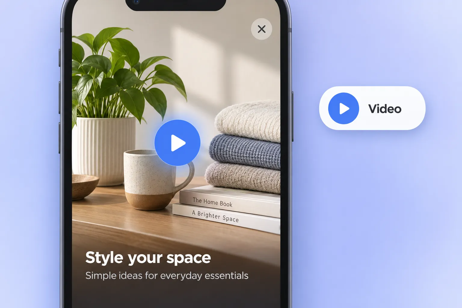
- Don’t interrupt: banner. A compact bar pinned to the top or bottom. The user keeps doing what they came for; the message is simply there. Use it for nudges that can wait a tap or two: an unfinished step, a new feature, a small reward.
- Interrupt a little: sheet. A panel slides up from the bottom, with a handle to drag it away. It says “one quick thing about what you’re looking at.” Contextual actions inside a session belong here: save this item, enable this setting, confirm this choice.
- Interrupt briefly: modal. A centered card over a dimmed screen. It stops the user, but only for one decision. Offers, updates, and yes/no moments.
- Take the whole screen: fullscreen, stories, carousel, video. These are for moments when the user is willing to stop. Onboarding, a big promo, a product walkthrough. Use them when the payoff justifies a full pause, and not because the layout looks impressive in the editor.
The ladder tells you how much screen to take. Now let’s break down each layout on its own: what it is, the moment it fits, the lifecycle stage, and the KPI to watch.
| Layout | What it is | Best moment | Lifecycle stage | KPI to watch |
|---|---|---|---|---|
| Banner | Compact bar, top or bottom, non-blocking | A nudge that shouldn't break the session | Engagement, retention | CTR |
| Sheet | Bottom panel with a drag handle | A contextual action on the current screen | Engagement, conversion | Interaction rate, journey goal |
| Modal | Centered card over a dimmed background | An offer or update that needs one decision | Conversion, winback | CTR, journey goal |
| Fullscreen | Edge-to-edge cover image with text and buttons | Onboarding, a major promo | Onboarding, conversion | Journey goal (activation, purchase) |
| Stories | Sequential full-screen slides with progress bars | A series of steps or features | Onboarding, feature adoption | Interactions, journey goal (feature used) |
| Carousel | Full-screen swipeable cards with pagination dots | A selection or catalog | Engagement, conversion | CTR to product, journey goal |
| Video | Full-screen HLS or MP4 player with overlay text and buttons | A product or feature demo | Onboarding, conversion | Interactions on the overlay button, journey goal |
Personalize your in-app message
A native layout is only half the value. The other half is that every field inside it can be changed per user.
3 personalization techniques cover most of what a marketer needs:
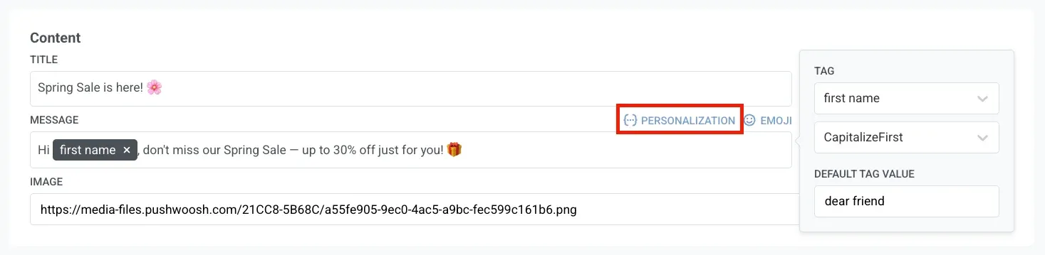
Dynamic content. Pull any user attribute into the copy — first name, plan, city, last purchased category — with format modifiers to keep it clean, then use Liquid for the conditional logic: show one offer to trial users and another to subscribers, swap the CTA by segment.
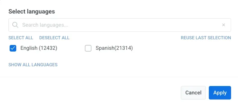
Localization. A native in-app starts in 1 language. Add more, and Pushwoosh copies the default content — text, images, and button labels — into each new language for you to translate. Every user then sees the version that matches their device language, so one message built once speaks each audience’s language.
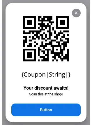
Barcode and QR generator. The native editor generates barcodes or QR codes and can pull the value from a device tag in the form {Coupon|String|}. Each user gets their own scannable code rendered on the device, with nothing to host and no image to generate on the side.
Native in-app in action: use cases & examples
Here’s what this looks like in real apps. Each case below starts with a problem you’ve probably seen in your own funnel, names the layout that fixes it, and walks through the setup in Pushwoosh.
👋 Onboarding: welcome users with fullscreen or stories
The problem: a new user opens the app for the first time and has to work out the value alone. Most first sessions end without it.
The capability: fullscreen owns the first screen for one clear welcome and a single action. Stories walks through the core features as tappable slides, progress bars showing how far there is to go.
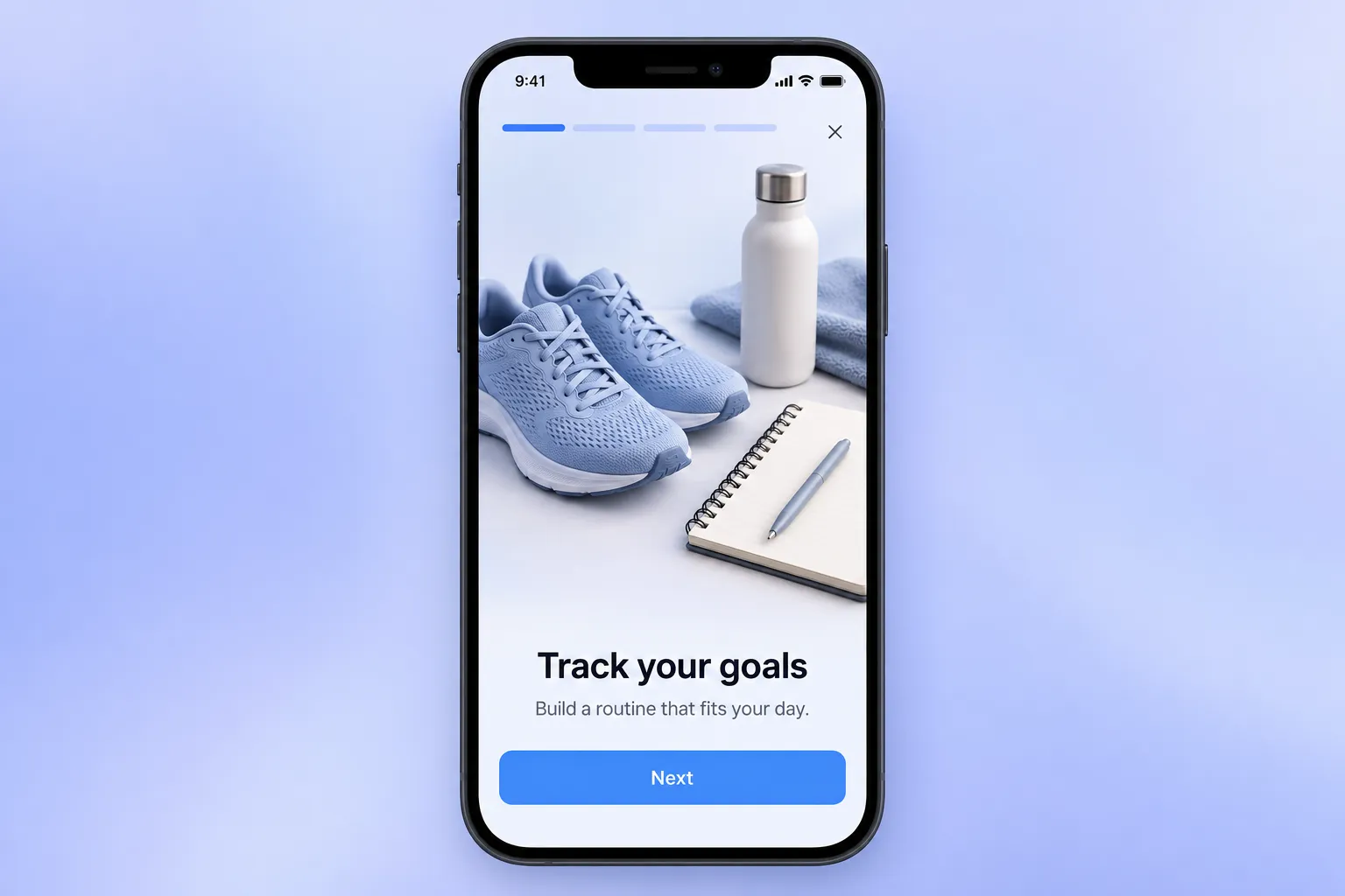
In Pushwoosh: on the first app_open, trigger a fullscreen with the main value and one CTA. Follow it with a stories message — one slide per key feature — to drive first use.
📖 More on this: welcome in-app messages.
💸 Winback: a modal with a coupon that scans
The problem: a lapsed buyer needs a real reason to come back, not just a “we miss you” message.
The capability: a native in-app template set as the push’s click action, so the tap opens a modal with a personal QR code from the {Coupon|String|} device tag.
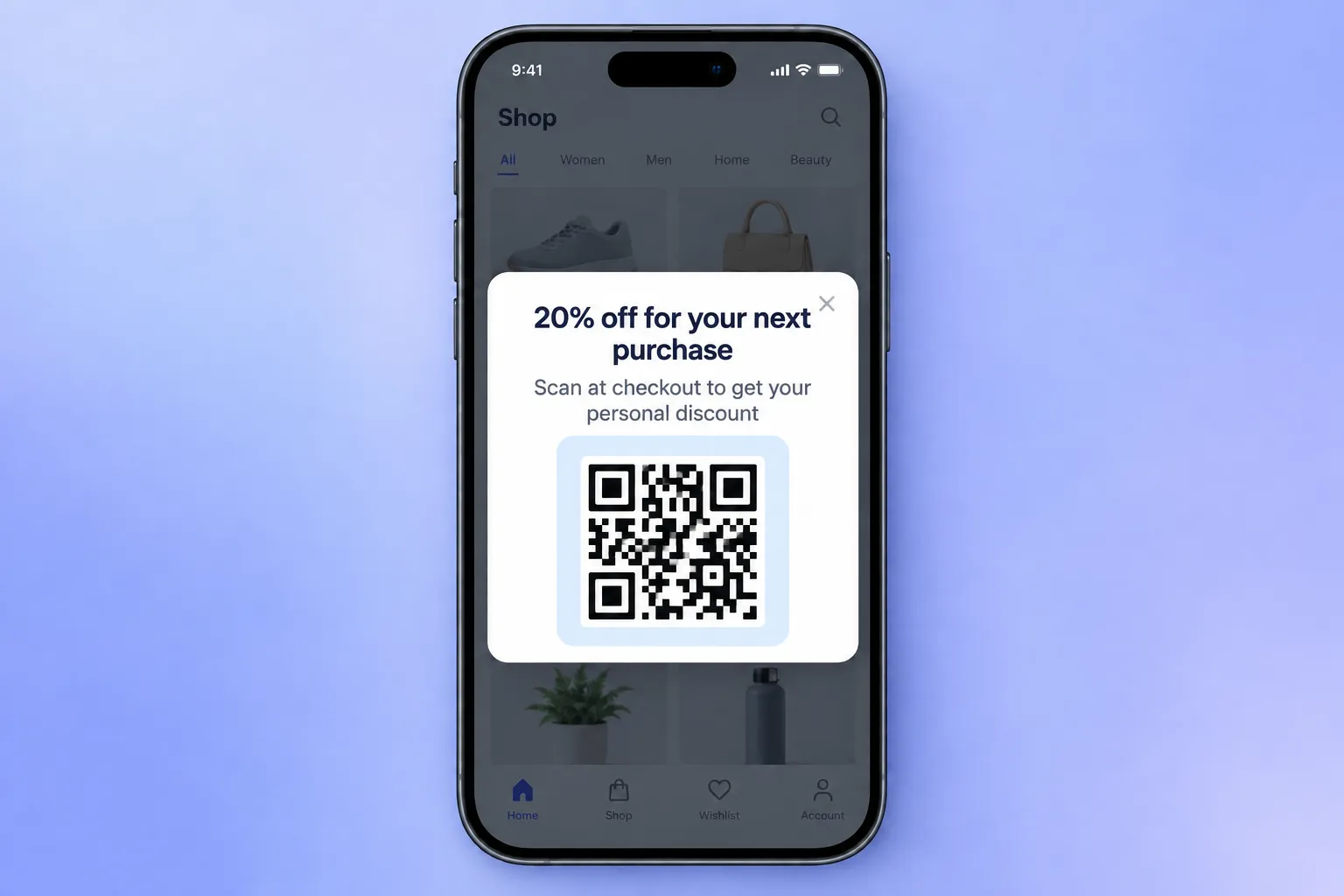
In Pushwoosh: segment buyers inactive 21+ days, show a modal carrying their personal code — scannable at the counter, no third-party image.
📖 Full breakdown of scannable coupon flows: coupon marketing for mobile apps.
🛍️ In-session: a carousel that works like a catalog
The problem: one static offer rarely matches what a given shopper actually wants.
The capability: the carousel layout, full-screen swipeable cards, with Liquid pulling the category name and copy from the user’s last viewed category.
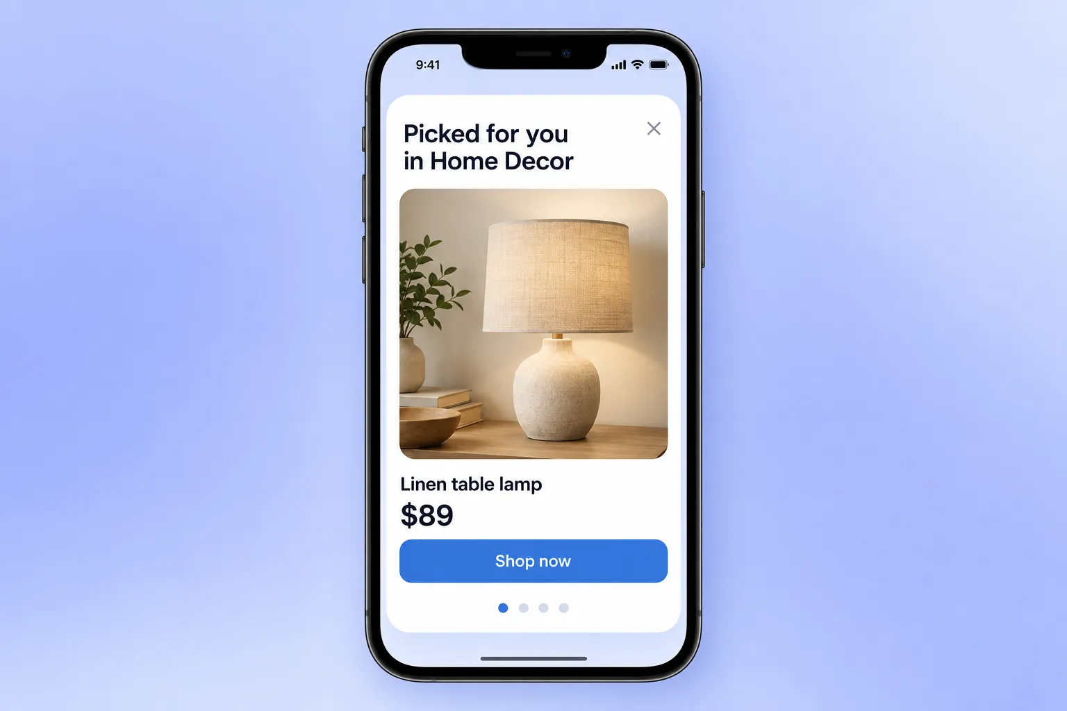
In Pushwoosh: trigger on a category view event, show a 4-card carousel: “Picked for you in {LastCategory}”, each card a product image, a price, and a button to the product page.
💳 Retention nudge: a banner that doesn’t interrupt
The problem: an investing or budgeting app has users who signed up, linked one account, and never finished verification. A modal on every open trains them to close modals.
The capability: the banner layout, pinned to the bottom, visible on every screen until the step is done, dismissible without losing the session.
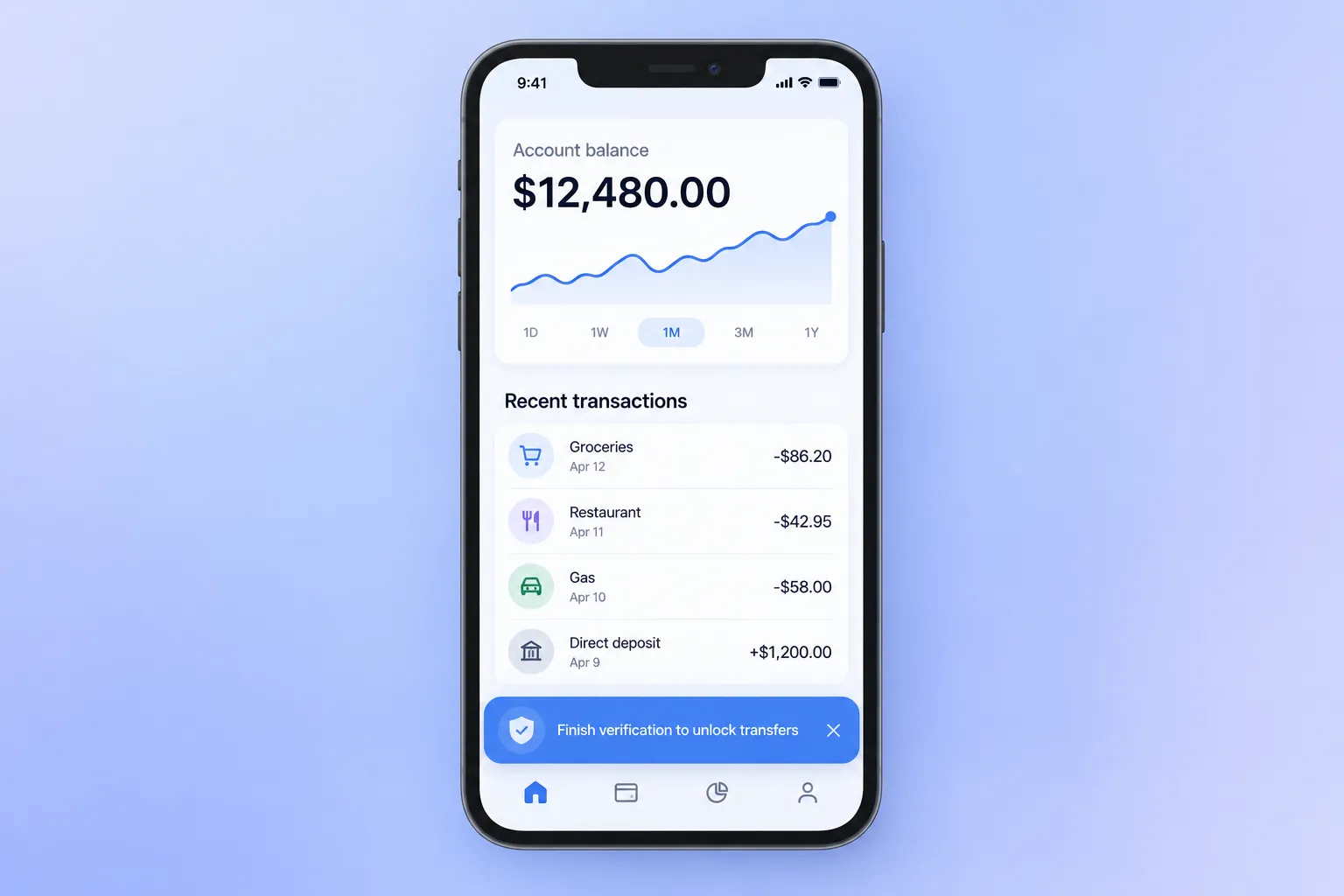
In Pushwoosh: when a user has an unfinished verification or an unused feature, show a banner — “Finish verification to unlock transfers” — one tap, zero interruption.
Build your 1st native in-app in 5 steps
The full path from a template to a live message in Customer Journey Builder:
-
Pick the layout by interruption level
Decide how much of the screen the message deserves, then choose the display type.
-
Build it in the native editor
Content → In-apps → Create in-app → Create native rich media. Fields are grouped into Content (text, images from a URL or Media storage), Config (colors, background, behavior), and Actions (buttons and what they do). The step-by-step guide covers every field.
-
Add tags and Liquid
Drop in a name, segment, offer, or a coupon code so each user sees their own version.
-
Check the live preview
The editor renders the message as it'll appear on the device. Check it here before it ships.
-
Launch
Set the trigger and audience, place the in-app node in the flow, and go live.
🚨 The mistakes that quietly break native in-apps:
- Shipping on an old SDK. Sheet, carousel, and banner need iOS 7.2.1+ / Android 6.10.1+; video needs Android 6.11.0+. Below the minimum, nothing shows.
- Thinking in HTML. Native isn’t a web view. You build from blocks and design for the layout, not for a page.
- Launching without a preview. Live preview exists so a broken render never reaches a user. Use it every time.
Engage users in-session with Pushwoosh native in-apps
Native in-app messages give you 7 ready layouts, per-user personalization inside every one, and a live preview that catches problems before they ship — no HTML, no design bottleneck. Pick the moment that matters most for your app: an onboarding step, a winback, a mid-session nudge, and build the in-app behind it.