Improving retention can feel like filling a leaky bucket: you pour in new users, and most drain away before Day 30. But that outcome isn’t fixed. With the right messaging at the right moments, you keep more people in the app and hold the user retention curve steadier for longer.
What is the user retention curve?
A retention curve is a graph showing how many of your users come back after their first session. Plot the share of active users against the days since install, and the line shows how sticky your app is.
Analytics and engagement tools build this for you. Amplitude and Mixpanel do it, and so does Pushwoosh, which generates the graph across whatever time windows fit your app so you can decide whether retention needs work.
How to calculate retention for the curve
Each point on the retention graph is a simple ratio. For any given day N:
Day N retention = (users active on Day N ÷ users who installed on Day 0) × 100
Say 1,000 people install your app on Monday. Seven days later, 220 of that same cohort open it again. Your Day 7 retention is 220 ÷ 1,000 × 100 = 22%. Do that for Day 1, Day 3, Day 7, Day 14, Day 30, and the row of percentages becomes your curve.
One thing worth flagging: always measure the same cohort over time. If you mix in users who installed on different days, the graph stops meaning anything.
Why the retention curve matters
A table of retention percentages is hard to feel. The retention graph makes it obvious. Early on the line always drops, because some people churn no matter what you do. What you’re watching for is the moment it stops dropping and levels off. That plateau is the signal that the people still with you have found real value and intend to stay.
Looking at the user retention curve
What are the types of retention curves?
- Flattening curve. The line falls, then plateaus at a steady percentage. That flat tail is the goal: low churn, a core of users who keep returning.
- Steep curve. The line keeps sliding with no plateau in sight. Engagement leaks away week after week, usually pointing to a weak onboarding, an unclear value, or a rough user experience.
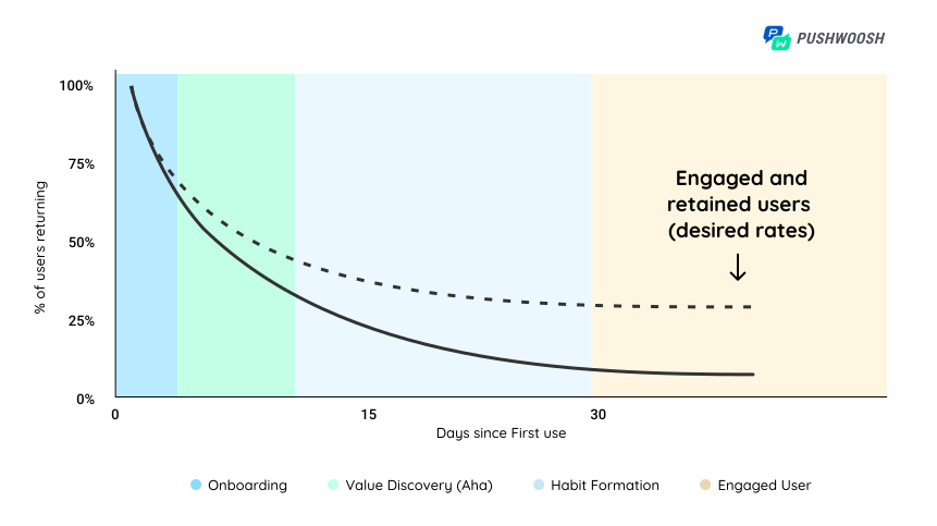
On the chart, the solid black line drops hard after Day 0. The dotted line holds up far better.
🔔 Not everyone will stick around from Day 0 onward, and that’s fine. The job is to cut the early drop-off as much as you can, which is what flattens the curve.
How to read your retention curve
Once you have the retention graph in front of you, the shape tells you where to look:
- A sharp cliff in the first few days usually means onboarding. People install, don’t reach the point, and leave before they understand what the app is for.
- A slow, steady bleed with no plateau points to value and habit. Users get it, but nothing pulls them back often enough to stick.
- Where the line finally flattens is your true retained core. If that happens at 5%, only one in twenty users is sticking; if it flattens at 25%, you have a healthy base to build on.
Two days are worth watching closely. Day 1 tells you whether onboarding lands, and Day 30 tells you whether the habit took. Move those two and the whole curve shifts with them.
How to flatten the user retention curve
The graph above splits into three stages a user passes through on the way to becoming fully engaged: onboarding, value discovery (the Aha! moment), and habit formation.
You flatten the curve by working these stages one at a time, each with its own triggered messaging. Click a stage to jump to its tips.
✅ Onboarding: tutorials and interactive walkthroughs get more signups completed. Win here and the rest of the journey gets easier.
👀 Value discovery: prove the app is worth it. Segmented emails and push notifications nudge users toward the actions that show them the value.
💪 Habit formation: external triggers, motivation, and small rewards turn use into habit.
You need to flatten your retention curve. But to do that, you need to understand what happens before people are retained. Break down your retention curve into different stages and learn what happens before users become engaged: onboarding, value discovery (Aha!), habit formation, and current user.

With the stages mapped, let’s take each one and build a personalized, automated communication strategy around it, starting with onboarding.
Onboarding: boost retention on Day 1 and beyond
Retention is a marathon, not a sprint, and that’s the frustrating part. If you only try to lift the retention graph at the later stages, you’re stuck waiting until Days 7 to 30 to see whether anything worked.
There’s a faster route. A strong onboarding experience changes the whole path a user takes, and it works early, where the curve falls steepest.
View the app onboarding optimization as a quick win: Invest in a few experiments at that initial stage and see how improved retention on Day 1 to Day 3 carries along an uplift in retention at subsequent stages.

So how do you tighten onboarding? A few reliable moves:
- Send personalized welcome messages to new users.
- Walk people through the app with an interactive tour that shows off key features.
- Test different onboarding scenarios against separate user cohorts.
You can build any of these in Pushwoosh Customer Journey Builder. On its canvas you can:
🔀 Plan, automate, and launch omnichannel flows
📱 Run interactive in-app walkthroughs
👀 Send push notifications to catch new users’ attention
Here’s an onboarding flow you can assemble on the canvas. The text description follows below.
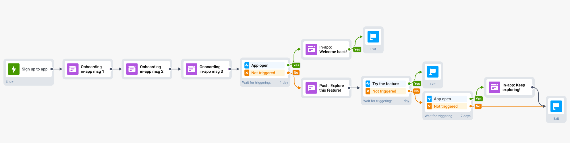
- A user signs up, and that event starts the Journey.
- They get a series of in-app messages, anything from a product tour to a preferences survey, depending on your goals.
- After the initial onboarding, give them a little breathing room before the next message.
- Wait for them to reopen the app. If they do, welcome them back with a feature to try. If they don’t return in time, trigger a push to draw them back.
- Wait for the push click and let them try the suggested feature.
- No response to the push? Set a trigger that waits up to 7 days for them to open the app.
- When they reopen, send an in-app message welcoming them back and pointing to a feature they haven’t tried yet.
⬆️ Level up: build dedicated journeys for different user segments and test how each responds. Customer Journey Builder gives you everything to refine onboarding until the early part of the curve flattens.
A real example. Omada, a coupons and discounts app, reworked its onboarding and lifted Day 30 retention by 4%. It got there by moving the intermediate numbers first:
👆 Conversion to activation action hit 67.4%
🤝 Day 12 retention hit 29%
Omada’s success story shows it plainly: to flatten your retention curve, fix its early stages first. You can give your own metrics the same lift.
Value discovery: activate users so they want to stay
With onboarding tuned, the next job is to put your best features in front of people and raise activation. This is the stage where you want the user to think, “Oh, I actually need this.”
The hard part is holding attention while every other app fights for the same minutes. Without a clear path to value, people drift and churn.
Activation isn’t as simple as counting signups or clicks. What counts as “activated” depends on your app and its goal. Work out:
- Which actions mark a user as activated, and which in-app events prove they happened?
- Do those events differ by segment?
- If so, how will you tell segments apart? For instance, will you treat organic installs differently from users who arrived via a paid ad? Tailoring messaging to acquisition source is one way to convert more of them.
Once the logic is set, plan messaging to push activation and retention along:
- In-app messages that walk users into parts of the app they haven’t explored.
- Emails for people who’ve been away and still haven’t hit those activation events. An exclusive promo inside the email helps on both value discovery and retention.
- Push notifications, maybe the fastest way to get an activation action done in a single tap. Lead with a key feature.
That’s a lot to plan and track, and it’s what Customer Journey Builder is for: it automates the flows and reports activation events in the same interface. A setup looks like this:
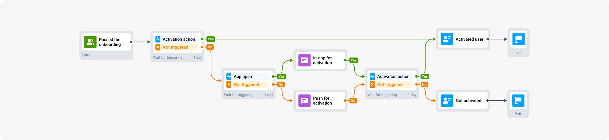
- Target users who’ve cleared your onboarding flow.
- Wait for the activation action.
- If it doesn’t happen, send an in-app message nudging it.
- If they still don’t activate and start slipping away, re-engage with an email or push that leads on your app’s value.
When the value message lands, the app becomes a normal part of someone’s day. As usage climbs, you’ll see longer sessions, more feature adoption, and more conversions, all signs that value discovery and retention are working.
Habit formation: retain users through triggers, motivation, and reward
Keeping people engaged over months takes more than a one-time spark of interest. You need repeat visits that happen without a prompt from you, the kind that hold up the far end of the curve.
That’s hard, because uneven engagement is normal for whole categories of apps.
🛫 Travel apps might get used a couple of times a year. Between trips, people forget the app is even installed.
💪 Education and training apps demand effort from the user, so consistent use is a fight. The app has to supply motivation and help build the habit.
To build that habit, lean on a few engagement mechanics:
External triggers, mainly push and email, are what motivate a user to come back and act.
Reward is about giving a good feeling fast, ideally right after the app opens. TikTok is the extreme case: open it and it instantly serves a video tuned to your taste.
🤩 Your app doesn’t have to be as addictive as TikTok. Triggered messaging through Pushwoosh gets you strong retention without it.
Use Scheduled Launch to send repeating daily or weekly reminders. The push lands at the time you set and prompts the action you want.
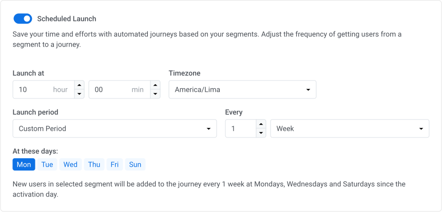
Back those push triggers with in-app messages, for example inviting a user to start a workout to build the motivation to keep going.
Here’s a scheduled-reminder setup for a fitness app in Customer Journey Builder:

Craft scheduled campaigns with Pushwoosh and the usage habit starts to set in. Expect better activation and retention, more frequent sessions, and a flatter curve.
📊 Track how the habit-forming messaging performs and tune it over time with Pushwoosh Statistics reports.
Flatten the user retention curve strategically with Pushwoosh
Retention can feel like a losing fight, but with targeted messaging it doesn’t have to be. Break the new-user journey into its stages, onboarding, value discovery, and habit formation, and give each one a personalized, automated communication strategy. Work them in order and the curve flattens where it counts.